Menu
INK & CLAY 45 ARTISTS' STATEMENTS

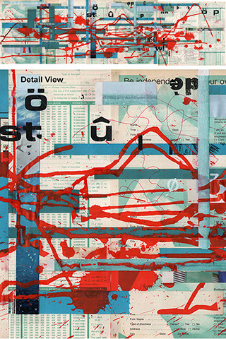


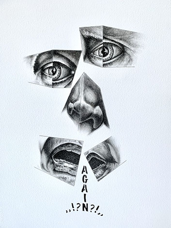


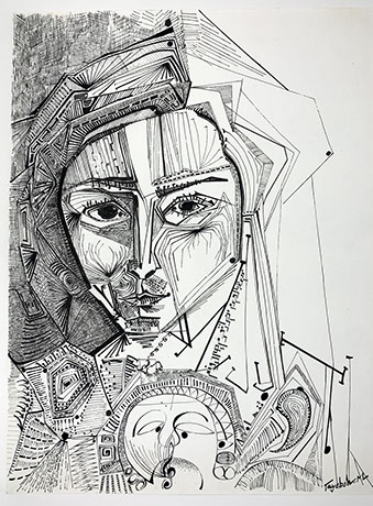
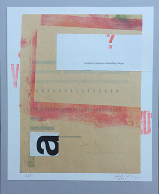


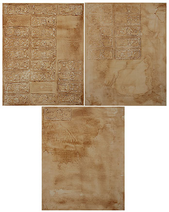


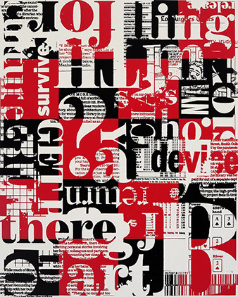


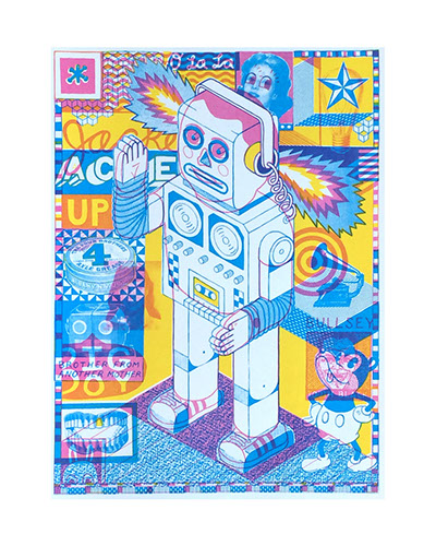


Robert Alexander
Terrain/Tirer Parti_03, 2020
survey card, magazine letraset type, ink 26 x 12”
Image use courtesy of the artist
Item 001.002 - Ink Used in Creation of Work
Sale Price (plus tax): $1,250.00
My work uses the tools and media from an era where architectural and design representation were exclusively analog. These tools, previously used to produce the designs for buildings, furniture, and other objects, are collaged with magazine pages and ads that once delivered a message that defined ‘good design’ for professionals. My work scrambles and misuses elements found in these places to express alternate universes, topographies, landscapes, and scenes.
Robert Alexander
Terrain/Tirer Parti_01, 2020
survey card, magazine letraset type, ink 26 x 12”
Image use courtesy of the artist
Item 001.001 - Ink Used in Creation of Work
Sale Price (plus tax): $1,250.00
My work uses the tools and media from an era where architectural and design representation were exclusively analog. These tools, previously used to produce the designs for buildings, furniture, and other objects, are collaged with magazine pages and ads that once delivered a message that defined ‘good design’ for professionals. My work scrambles and misuses elements found in these places to express alternate universes, topographies, landscapes, and scenes.
Ingrid Ankerson
Cube No. 4, 2020
letterpress, metal type and ink
12 x 12”
Image use courtesy of the artist
Item 002.005 - Ink Used in Creation of Work
Sale Price (plus tax): $125.00
I'm interested in exploring the possibilities of typography and in using the ‘old school’ method of printing to do it. As a letterpress printer, I use small, metal pieces of type, traditionally used for printing books, in order to create shapes, textures, dimensions, and patterns. I organize each letter by hand on the bed of my press, print what's there, move the form, and print again. A single piece of paper may go through my press hundreds of times to achieve the resulting shape or pattern.
Ingrid Ankerson
Radial Pattern No. 7, 2020
letterpress, metal type and ink
12 x 12”
Image use courtesy of the artist
Item 002.004 - Ink Used in Creation of Work
Sale Price (plus tax): $125.00
I'm interested in exploring the possibilities of typography and in using the ‘old school’ method of printing to do it. As a letterpress printer, I use small, metal pieces of type, traditionally used for printing books, in order to create shapes, textures, dimensions, and patterns. I organize each letter by hand on the bed of my press, print what's there, move the form, and print again. A single piece of paper may go through my press hundreds of times to achieve the resulting shape or pattern.
Ingrid Ankerson
Dyadic Radial No. 6, 2020
letterpress, metal type and ink
12 x 12”
Image use courtesy of the artist
Item 002.003 - Ink Used in Creation of Work
Sale Price (plus tax): $156.25
I'm interested in exploring the possibilities of typography and in using the ‘old school’ method of printing to do it. As a letterpress printer, I use small, metal pieces of type, traditionally used for printing books, in order to create shapes, textures, dimensions, and patterns. I organize each letter by hand on the bed of my press, print what's there, move the form, and print again. A single piece of paper may go through my press hundreds of times to achieve the resulting shape or pattern.
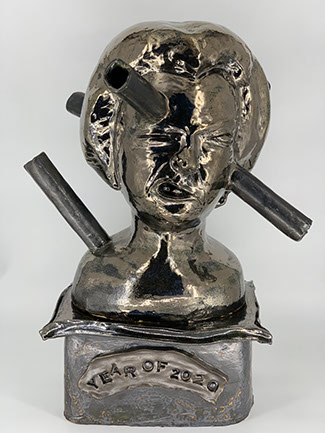
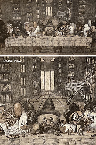
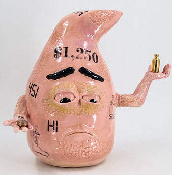
Pascual Arriaga
Ouch!, 2020
coil and slab ceramic
31 x 24 x 20”
Image use courtesy of the artist
Item 003.006 - Clay Used in Creation of Work
Sale Price (plus tax): $3,750.00
From a deadly pandemic to a global movement for racial justice to fake news. The year 2020 was definitely full of disruptive events. Events like protests and riots, to lockdowns and quarantines, it seemed that there was something new to deal with every day. Once one problem was solved, it seemed like two more arose. The sculpture Ouch! is evoking the feeling of an excruciating headache after being smacked by 2020. The bust is also representing a headstone now that 2020 has passed. Memorializing 2020, so we remember the lessons learned but still move on with our lives. With so many things happening and changing so rapidly in 2020, it definitely had an impact on everyone. How was your experience in the year of 2020?
WARNING: MAY CAUSE... ... ... ...?
Pascual Arriaga
Covid Relief, 2020
slip-cast ceramic, acrylic paint, cardboard
10 x 21 x 16”
Image use courtesy of the artist
Item 003.007 - Clay Used in Creation of Work
Sale Price (plus tax): $1,250.00
From a deadly pandemic to a global movement for racial justice to fake news, the year 2020 was definitely full of memorable events. From losing jobs, losing your health to losing relationships. 2020 was full of tests and struggles that was overwhelming people with different emotions. When these trials of tribulations arrive, people need ways to deal with them. Well, you are in luck! For a limited time only, get your Government Issued Emergency Stimulus Packs: Glazed in army green, filled with false hope, empty promises, and delusions. Shipped straight to your door so you don't even have to leave the comfort of your house. Just sit back and let your trusted government take care of you.
WARNING: MAY CAUSE... ... ... ...?
Mariona Barkus
Systemic Racism, 2020
archival digital print on paper
24 x 20 x 1”
Image use courtesy of the artist
Item 004.008 - Ink Used in Creation of Work
Sale Price (plus tax): $1,250.00
Trying to conceptualize some self-comforting verbal response to this endless deadly pandemic reality, I came up with the idea of acceptance - accepting the uncertainty instead of freaking out over a situation beyond my control. Instead of PANIC spiraling out of control, I could "embrace uncertainty" with text in a spiral, albeit a wobbly spiral, perhaps not yet convinced myself! But I plowed ahead, summoning my courage through repetition of the text. Thus "Whistling in the Dark" describes the process. As I worked, I also reminded myself of my own ability to bounce back in past painful experiences; thus, I added the ring of ‘resilience’ text. Hopefully, this painting provides solace to you, too.
Inspired by recent events, this is the newest addition to my ongoing series, Illustrated History. Since its inception in 1981, my series has chronicled contemporary social and political issues in the form of postcard folios, broadsides, and poster installations. Images combine fabricated illustrations with factual texts that resemble a newspaper.
Featured topics are chosen for their impact on our future, the absurdity of their content, and, at times, for some combination of both. Lately, the ‘news’ has become more and more grim. The discipline of continuing Illustrated History over the years has been an anchor of my artistic practice.
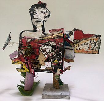
A. BINGHAMFREEMAN
Heart Surgeon, 2021
Ink, acrylic, paper, watercolor, wire
18 x 13.5 x 11”
Image use courtesy of the artist
Item 005.009 - Ink Used in Creation of Work
Sale Price (plus tax): $3,125.00
My art is always driven by gesture and contour. I am interested in an authentic expression of my own ideas about life and my life experiences. The gesture is vital in my connection to personal intuition. Extrapolating organic form is personally satisfying to me. I am interested in the human figure, animals, myth, and archeo-mythology. Originally trained as a printmaker, I learned to work into the plate to create a deep experience between the plate or block and paper. I love paper and clay. Later in my life, I learned to weld and returned to working with clay, ink, paper, mixed media, and book-making.
MARIKO BIRD
Which Animal Are You? #1, 2020
high fire stoneware
18 x 14 x 12”
Image use courtesy of the artist
Item 006.010 - Clay Used in Creation of Work
Sale Price (plus tax): $1,250.00
The characters etched on the faceted surface represent twelve zodiac animals in Japanese culture: ‘rat, ox, tiger, rabbit, dragon, snake, horse, sheep, monkey, rooster, dog, boar.’ The year you were born in determines which animal you are. For example, if you were born this year, you are the ox, and so on. The three-legged vase was hand-built with a white stoneware clay and fired to Cone 10.
CHESS BRODNICK
The Recipient, 2020
sumi-e ink on paper
30 x 22 x 2”
Image use courtesy of the artist
Item 007.011 - Ink Used in Creation of Work
Sale Price (plus tax): $1,250.00
The Recipient is a representation of being assaulted over again with the daily anxiety of working with people infected with COVID 19, as well as the tumultuous social events taking place in our cities due to racial injustice. I reach the feeling of trying to connect and not being able to. Reaching with all one’s ability as a person and not knowing if a connection will be made.
I will not be appropriated. It is the struggle of maintaining one’s identity and place in the world. Setting personal boundaries and holding them.
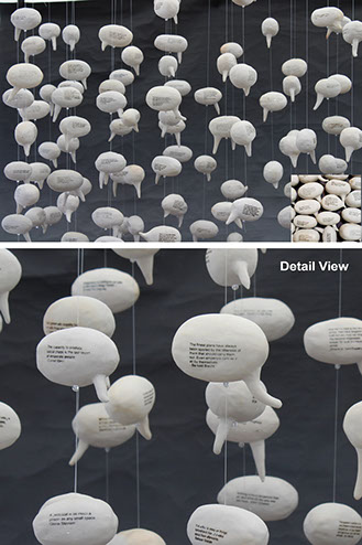
ANDRA BROEKELSCHEN
NFT (Non Fungible Touch), 2021
monotype print collaged with braille paper and lenses
10 x 16”
Image use courtesy of the artist
Item 008.090 - Ink Used in Creation of Work
Sale Price (plus tax): $1,250.00
The mixed media piece, NFT (Non Fungible Touch), was conceived while looking at a braille museum brochure. The combination of legible and illegible text framing the selected passages of braille script seemed conflicting and complementary at the same time. Oil-based ink was used to create the monotype print on BFK Rives paper. Lenses were added to focus on a specific passage in the text.
Writing text with pen and paper or on digital devices is tactile. Words expressed in written, spoken, or sign language are either seen or heard. Braille needs touch. The idea that a blind person reads, not to touch something, seems adverse. The reading lenses focus on a slightly different message.
Mostly self-taught, I work in printmaking, metalsmithing, and mosaic. Fascinated with letters, numbers, and symbols, they are often included in my artwork. Each piece that I create comes from a personal experience, a photo I take, a found object that speaks to me. The different media I work in were learned to fulfill the vision I had for one piece or another. I hope my work transmits the spark that made it come to life in the first place.
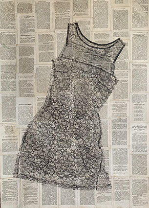
ANDRA BROEKELSCHEN
The Little Black Dress, 2019
monotype print oil-based ink on old prayer book pages
43 x 31”
Image use courtesy of the artist
Item 008.012 - Ink Used in Creation of Work
Sale Price (plus tax): $1,875.00
Seemingly floating, the Little Black Dress has an airy light feel to it. The artist's own dress was printed with oil-based ink on old prayer book pages collaged to 100% cotton paper.
The Contemplation and Prayer book, printed in Germany in 1858, is well worn. Many hands have turned the pages in contemplation; being in the eighth edition, it breathes a timeless murmur. How often have the thoughts of the reader wandered off the pages to more earthly subjects? The black lace of the dress seems to tangle with the old German script.
Printmaking, mixed media, metalworks, sculpture, and mosaic all interest me equally. Mostly self-taught, I tend to approach each subject ready to learn a new skill. All of my art has a personal connection, using objects that I have worn, handled, or collected. An inner voice tells me to keep and gather seemingly superfluous items and transform them into a new creation.
ANDRA BROEKELSCHEN
Window to the Sea, 2020
sculpture: steel, wood, glass, tile, clay, pottery, found objects
66.5 x 22.5 x 2”
Image use courtesy of the artist
Item 008.013 - Clay Used in Creation of Work
Sale Price (plus tax): $10,000.00
A simple oval frame provides a window to the setting beyond. The base structure made out of wood and steel is adorned with colorful glass, seashells, antique doorknobs, silverware, mirrors, tile, and old hardware. All are unified by charcoal tile grout.
The sculpture, the artist’s first, combines many of the disciplines that were practiced in the years prior. Seashells and tile made out of clay by the artist, fired and glazed. Sea glass and found objects collected over a lifetime. Carefully arranged, each side of the sculpture conveys a different feeling.
One side has a limited palette and a more rustic look, conveying memories of a sunrise or sunset by the sea. The other side is very colorful and with a nod to Art Deco style. The question mark in the upper left corner intends to stop the viewer and question what is in front of them and what is beyond.
As a printmaker, collage artist, and metalsmith, mostly self-taught, the mosaic sculpture was a natural extension of the artist's practice of trying to acquire new skills to bring an idea to fruition. metalsmith, mostly self-taught, the mosaic sculpture was a natural extension of the artist's practice of trying to acquire new skills to bring an idea to fruition.
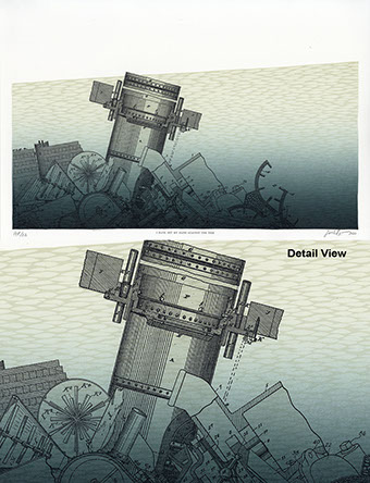
SARAH BRYANT
I Have Set My Hand Against The Tide, 2021
letterpress printed from metal type,
linoleum, and polymer
12 x 18”
Image use courtesy of the artist
Item 009.016 - Ink Used in Creation of Work
Sale Price (plus tax): $375.00
I am an artist who makes books. My projects have in common a repeated effort to reframe or reorganize existing information in order to challenge established narratives. I work in book form because of the natural relationship between the book and the communication of information. Our visual vocabulary developed simultaneously with the development of the book. They have worked together for over a thousand years to encapsulate information, to preserve it, and to pass it forward. I am interested in the simplicity of this diagrammatic language, which allows for slight variations in line, color, and format to describe a great variety of different systems; the movement of peoples, changes in climate, the progress of disease. This flexibility speaks to our need to connect, to find patterns, and to place ourselves in a world we can understand and explain.
I Have Set My Hand Against The Tide is a debris field of patent drawings for floodgates, water pumps, caissons, and levees, all mechanisms designed to keep the water out. The title is adapted from United States Patent No. 123,002, a caisson design proposed by James B. Eads in 1872. At first, a project about the rising sea, this print evolved during a pandemic year. A caisson is a watertight chamber and a workspace safe from outside forces. A floodgate is a mechanism of control over the flow of the tide and the last restraint against an external threat. Produced in an edition of 22 for an exchange with several artist proofs.
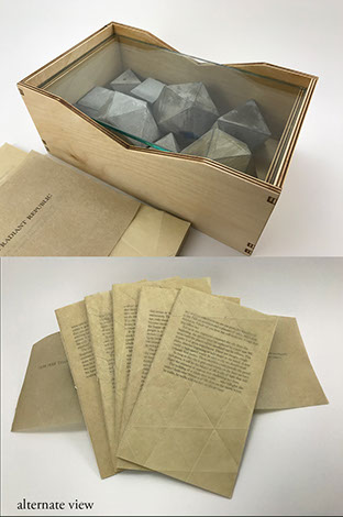
SARAH BRYANT
The Radiant Republic, 2019
letterpress on paper, housed in wood, glass, cement
11 x 7 x 5”
Image use courtesy of the artist
Item 009.015 - Ink Used in Creation of Work
Sale Price (plus tax): $2,375.00
I am an artist who makes books. My projects have in common a repeated effort to reframe or reorganize existing information in order to challenge established narratives. I work in book form because of the natural relationship between the book and the communication of information. Our visual vocabulary developed simultaneously with the development of the book. They have worked together for over a thousand years to encapsulate information, to preserve it, and to pass it forward. I am interested in the simplicity of this diagrammatic language, which allows for slight variations in line, color, and format to describe a great variety of different systems; the movement of peoples, changes in climate, the progress of disease. This flexibility speaks to our need to connect, to find patterns, and to place ourselves in a world we can understand and explain.
The Radiant Republic is an artist book about ethics and urban planning. The text at the core of the project is a citybuilding narrative comprised entirely of language excerpted from Plato's Republic (c. 380 BCE) and Le Corbusier's The Radiant City (1933 CE). In these original texts, separated by more than two thousand years, Plato and Le Corbusier each describe city plans which prescribe morality and ethics. These works are revered, but they are also deeply troubling, advocating the destruction of existing cities, the separation of children from their families, and the connection between city planning and warfare.
In The Radiant Republic, a five-part narrative describes the life cycle of an imagined city using unedited language woven together from the original sources. Each part is bound separately as a pamphlet and contains one section of an interlocking landscape with no fixed beginning or end. Platonic solids, a set of five shapes made up of equilateral faces set at equal angles, feature heavily in the printed imagery. Since ancient times, these shapes have been held up as a physical manifestation of the perfection of form. But one cannot create a perfect object, and one cannot build a perfect city. This is a book about the voices we value, the ideals they espouse, and the consequences of venerating their views. The Radiant Republic is housed in an enclosure made of wood and glass containing weathered platonic solids cast in cement.
Letterpress printed from linoleum and polymer plates in an edition of 50 copies in 2019. Papers include arches text and handmade Belgian Flax from the Morgan Conservatory. Box materials include Laser-cut birch plywood, cast cement, glass, and Dubletta book cloth.
SARAH BRYANT
REF, 2019
letterpress, risograph,
screenprint, digital printing
9 x 11 x 4.5”
Image use courtesy of the artist
Item 009.014 - Ink Used in Creation of Work
Sale Price (plus tax): $1,875.00
I am an artist who makes books.in common a repeated effort to reframe or reorganize existing information in order to challenge established narratives. I work in book form because of the natural relationship between the book and the communication of information. Our visual vocabulary developed simultaneously with the development of the book. They have worked together for over a thousand years to encapsulate information, to preserve it, and to pass it forward. I am interested in the simplicity of this diagrammatic language, which allows for slight variations in line, color, and format to describe a great variety of different systems; the movement of peoples, changes in climate, the progress of disease. This flexibility speaks to our need to connect, to find patterns, and to place ourselves in a world we can understand and explain.
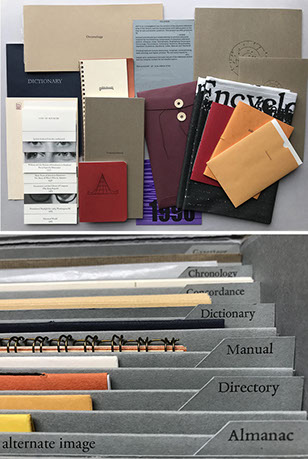
REF is an investigation into the erosion of the physical reference area of the library and the fundamental shift taking place in the way we ask and answer questions. Reference sources evolved over hundreds of years to answer specific types of questions that have emerged over time as we have sought to engage with information. Atlases, chronologies, encyclopedias, directories, and other related reference types each satisfied a particular method of seeking information. Where? When? Who was responsible? What else was happening during this time? How was this accomplished? We have moved away from the use of these resources toward the use of keyword searches. As a result, we are able to access information with great speed but are losing the aspect of translation that enabled us to seek nuanced answers to carefully posed questions.
For this artist book, a collective of five artists worked together to produce a complete reference section. 15 components, each inspired by a traditional reference type, are housed together in a custom flip top document box. As an organizing principle for the project, artists selected a set of dates related to the shift away from the use of physical reference texts toward our reliance on algorithmic relevance. References to these dates and events can be found in each component, alongside other themes related to mapping, information, and documentation.
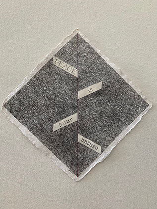
DIANE DIVELBESS
Peace Is Your Nature, 2021
graphite and ink on paper
15.5 x 15.5”
Image use courtesy of the artist
Item 010.017 - Ink Used in Creation of Work
Sale Price (plus tax): $562.50
My mixed-media drawing uses graphite and ink, and since the foundation paper is a very roughly textured and pebbled Indian Village Paper, I collaged pieces of smoother surfaced rag paper for the stenciled lettering. The angled placing of the word pieces is intended to give the illusion of ascending - an uplifting feeling to the message, Peace Is Your Nature. The drawing, though square, has been deliberately turned ‘on point.’ The resulting diamond shape not only allows more room for the word pieces to hang along the central axis but it creates a more dynamic composition overall. Additional contrast is created by the almost "molten" texture of the deckle edge.
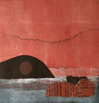
JOANNE DONNELLY
Red Sunset, 2019
monotype with collage
13 x 13 x 1”
Image use courtesy of the artist
Item 062.091 - Ink Used in Creation of Work
Sale Price (plus tax): $562.50
Red Sunset with Mountain is another part of a series of monotypes with collage elements which depict reimagined landscapes. This piece was created in response to the massive fires that engulfed several areas of the United States
during the recent summers.
JEFF DOWNING
Twenty-twenty, 2021
ceramic stoneware, glaze pencil, glaze
14 x 20.5 x 1.5”
Image use courtesy of the artist
Item 011.018 - Clay Used in Creation of Work
Sale Price (plus tax): $1,500.00
2020 was a year like no other. This work was inspired by several published online articles that featured words and phrases sent in by readers that best sums up the pandemic of 2020. Researching several blogs, I carefully chose the words and phrases that were most revealing of our range of experiences. The words are scribed on the ceramic form that it is symbolic of our collective state of lockdown.
KEVIN EATON
Cookie Jar No. 5, 2020
ceramic
15.5 x 12 x 12”
Image use courtesy of the artist
Item 012.019 - Clay Used in Creation of Work
Sale Price (plus tax): $1,250.00
Cookie Jar No. 5 (2020) is another in a series exploring the potentially destructive nature of masculine energy. Is it a missile? A penis? Or just a cookie jar that you shouldn't try to plug in? SPLOOSH!
KEVIN EATON
KRR-PTZ! Jar, 2020
ceramic
17 x 12 x 8.5”
Image use courtesy of the artist
Item 012.020 - Clay Used in Creation of Work
Sale Price (plus tax): $1,250.00
KRR-PTZ! Jar (2020) is another in a series exploring the potentially destructive nature of masculine energy. The cartoon-like treatment of the onomatopoeia, along with the phallic, rocket-like shape, creates an out-of-this-world cookie jar. What sort of cookies would you keep inside?
KEVIN EATON
BOING! Wall Plaque, 2020
ceramic
14.5 x 14.5 x 1”
Image use courtesy of the artist
Item 012.092 - Clay Used in Creation of Work
Sale Price (plus tax): $1,250.00
BOING! Wall Plaque, (2020) is a frenetic explosion of masculine energy. The cartoon–like treatment of the onomatopoeia, along with the potently suggestive arrows and gears, make for a fun and sexy work of art.
WILLIAM FILLMORE
William & George, 2019
painted stoneware
12 x 15 x 12”
Image use courtesy of the artist
Item 063.093 - Clay Used in Creation of Work
Sale Price (plus tax): NFS
My work coasts on the edge of reverence for the tradition of object making and the temporality of experiential performance as it provides a sarcastic personal vision of both my surreal static present, and the dark mystical future. I enjoy fabricating objects that are both surrealistically representational and optimistically nihilistic as they giggle at the edge of the stagnant constancy of individual awareness within the mysterious decay of time. I subtly carved the initials of William, 'W', on the soles of “William’s” shoes.
A dream from childhood long dead,
I hear the smiling laughter
The lasting impression
A lost mentor and a friend
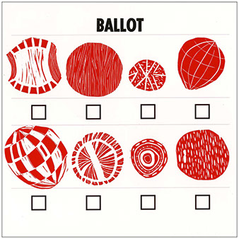
DIANE FINE
BALLOT, 2020
letterpress, linocut and digital print
13 x 13”
Image use courtesy of the artist
Item 013.021 - Ink Used in Creation of Work
Sale Price (plus tax): $500.00
This piece was made as the 2020 US presidential election was fast approaching. If only we had more choices...more varied choices. If so, we would need to be more engaged to discern nuance and difference.
HELLENMAE FITZGERALD
The Great Gig In The Sky, 2021
ink and fire on paper, mounted on birch
20 x 16 x 3”
Image use courtesy of the artist
Item 014.022 - Ink Used in Creation of Work
Sale Price (plus tax): $1,625.00
This piece is a portrait of my biological father. It's based on an old black and white photo. He was a musician by trade. He got a ‘full-time gig’ playing trumpet for the United States Navy Band, which is where he met my mother. Every summer, the Navy Band would perform on the steps of the Capitol Building in Washington D.C. I never got to see him play. My father was a chronic alcoholic and gambler. My parent's marriage ended badly when I was a baby. He was never a part of my life. When I was 19 years old, I asked my maternal grandmother for his address and took a spontaneous, unannounced road trip to meet him. He was drunk when I arrived. If he was happy or surprised to see me, it didn't show. He mostly talked about how much he hated my mother, and then he played his trumpet. He was good, really good. I never saw or heard from him again. I heard that he died from cirrhosis of the liver. This piece is about mourning a person I never knew. It acknowledges the fact that he never showed up for me as a father while honoring the incredible love and talent he had for music. Whatever his flaws were, he mastered his craft. In the night sky, barely visible, I incorporated sheet music from Pink Floyd's "The Great Gig in the Sky" and, throughout the rest of the piece, "Time," "Another Brick in the Wall," "Money," and "When the Tigers Broke Free." I also incorporated sheet music from Mozart's "Requiem," The Animal's "House of the Rising Sun," "Memory" from the musical Cats, and
Rachmaninov's "Bless the Lord Oh My Soul." These songs are some of my favorites, and they helped me come to terms with this loss. On my father’s right eye, stretching out into the moon behind him, barely visible, is a line from one of Lord Byron's poems: "And there with a swan song, I can die." The U.S. capitol, at the bottom of the piece, is found on the back of every $50 bill. This landmark is where my parents met. For better or worse, they both joined the military because they were musicians who wanted steady paychecks, the effects of capitalism. Capitalism is the reason our ocean levels are rising, represented by the waves crashing over the Capitol. Above the two trumpet swans face each other. My parent's connection, however badly it ended, gave me life. Their blood is pumping through my heart and veins. Because of them, I exist.
KATIE FRANCIS
Never Again, 2021
stoneware
21 x 8 x 7.5”
Image use courtesy of the artisI
Item 015.023 - Clay Used in Creation of Work
Sale Price (plus tax): $750.00
Never Again explores the experience of loss, the ephemeral, and change over time. I utilize the making process to reflect on what once was, having mixed feelings of warmth for their existence and grief for their loss. This piece was
created with these fleeting moments in mind, expressing this poignant nostalgia through a ceramic vessel. Never Again reflects on my own personal experiences of loss regarding memory, loved ones, and life as we once knew it. I emulated this temporality through the building and dismantling of the vessel. This dysfunctional vessel expresses the dark side of reflection, the mourning for what is gone. The surface contains a text, specifically a poem, that has been made partially illegible through aggressive alterations, smudges from handling, and glazes. It is evident that this object once functioned in a traditional sense, but the external forces that I have imposed have altered how it functions now. Although heavily distorted, this vessel still stands tall, displaying strength, confidence, and resilience. By firing the piece, the process of change has come to an end, leaving this destruction in the past and moving forward from the events that I reflected on during the making process. Through the given text, form, and surface, this dysfunctional vessel functions as a memento for the past, a reminder of temporality, and an opportunity for viewers to associate their own narratives with the altered object.
MARK HENDRICKSON
Ink & Clay 45 #1, 2021
ceramic
11 x 8 x 8”
Image use courtesy of the artist
Item 016.024 - Clay Used in Creation of Work
Sale Price (plus tax): $400.00
On this piece, I inscribed horizontally “INK&CLAY45” over and over one line under another into a clay cylinder until the whole piece was inscribed. This cylinder was made by hand manipulating a solid cylinder of clay. Using a system of graduated size dowels, I inserted the smallest diameter dowel into the vertical center of the solid clay cylinder. Then laying it horizontally on a canvas board and roll the cylinder with pressure until I have achieved the desired cylinder wall thickness. I then, using dowels and rubber ribs, hand-stretched the inscribed cylinder to the desired shape. Next, a white slip was sprayed on the entire piece, then allowed to dry, then to be bisque fired. After bisque firing, I apply a black stain composed of black copper oxide, manganese dioxide, and Gerstley Borate to the entire piece, then allow it to dry. Using gum erasers, I rub off the complete outer surface of the piece, leaving the stain in the design element and subsequent rips, tears, and cracks which can appear during the construction of the said piece. I then sprayed the same stain into the interior of the piece, then fired said piece to cone 2 in an electric kiln.
MARK HENDRICKSON
Ink & Clay 45 #2, 2021
ceramic
11 x 7 x 7”
Image use courtesy of the artist
Item 016.025 - Clay Used in Creation of Work
Sale Price (plus tax): $400.00
On this piece, I inscribed vertically "INK&CLAY45" over and over one line next to the last line into a clay cylinder until the whole piece was inscribed. This cylinder was made by hand manipulating a solid cylinder of clay. Using a system of graduated size dowels, I insert the smallest diameter dowel into the vertical center of the solid clay cylinder. Then laying it horizontally on a canvas board and roll the cylinder with pressure until I have achieved the desired cylinder wall thickness. I then, using dowels and rubber ribs, hand-stretched the inscribed cylinder to the desired shape. Next, a white slip was sprayed on the entire piece, then allowed to dry, then to be bisque fired. After bisque firing, I apply a black stain composed of black copper oxide, manganese dioxide, and Gerstley Borate to the entire piece, then allow it to dry. Using gum erasers, I rub off the complete outer surface of the piece, leaving the stain in the design element and subsequent rips, tears, and cracks which can appear during the construction of the said piece. I then sprayed the same stain into the interior of the piece, then fired said piece to cone 2 in an electric kiln.
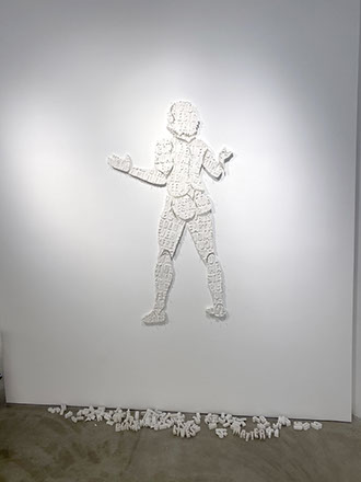
K. RYAN HENISEY
Babel, 2020
plaster castings
72 x 36 x 1”
Image use courtesy of the artist
Item 017.026 - Clay Used in Creation of Work
Sale Price (plus tax): $2750.00
Plaster castings of a figure imploring the heaven. Letters form fragments of words along the body parts. Impressed into the casting mold, the letters stand in relief. Mounted with nails and T-pins.
As a California-based artist, K Ryan Henisey's work is heavily influenced by the people, culture, and landscape of the local community and Golden State. His personal narrative is often interwoven with mythological subjects and symbols, using patterning as a vehicle to make meaning from deconstruction.
"I use a segmented form, highlighted with patterns and material," explains the artist. "With these two visual tools, I create connections within a context of deconstruction and Queer theory. Ultimately, I believe that meaning must be
constructed in order to hold value."
Henisey is a multi-disciplinary artist primarily working across performance, installation, and traditional paint and collage media. His work is unique in its ability to elevate the Queer experience using historical and spiritual references often barred to LGBTQIA+ peoples.
K Ryan Henisey (@kryanhenisey) is an award-winning West Hollywood artist and founding editor of Queer Quarterly Magazine. He is president of TAG Gallery in Los Angeles and founder of Pattern & Matrix, providing press and creative services for artists and organizations. Henisey's fine art has been displayed in institutions throughout Southern California, at the Garroxta Museum in Spain, and most recently in Guangzhou, China.
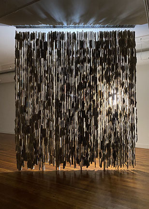
K. RYAN HENISEY
Innocence, 2021
apoxy clay, plaster, and cement,
acrylic, monofilament
108 x 13 x 13”
Image use courtesy of the artist
Item 017.027 - Clay Used in Creation of Work
Sale Price (plus tax): $1250.00
Thirteen plaster and cement hummingbirds trap a golden heart in a spiral of hanging monofilament. This ceiling-hung sculpture chandelier is made of 14 hanging parts. The epoxy clay heart is marked with spiraling phrases carved into the muscle of the organ.
As a California-based artist, K Ryan Henisey's work is heavily influenced by the people, culture, and landscape of the local community and Golden State. His personal narrative is often interwoven with mythological subjects and symbols, using patterning as a vehicle to make meaning from deconstruction.
"I use a segmented form, highlighted with patterns and material," explains the artist. "With these two visual tools, I create connections within a context of deconstruction and Queer theory. Ultimately, I believe that meaning must be constructed in order to hold value."
Henisey is a multi-disciplinary artist primarily working across performance, installation, and traditional paint and collage media. His work is unique in its ability to elevate the Queer experience using historical and spiritual references often barred to LGBTQIA+ peoples.
K Ryan Henisey (@kryanhenisey) is an award-winning West Hollywood artist and founding editor of Queer Quarterly Magazine. He is president of TAG Gallery in Los Angeles and founder of Pattern & Matrix, providing press and creative services for artists and organizations. Henisey's fine art has been displayed in institutions throughout Southern California, at the Garroxta Museum in Spain, and most recently in Guangzhou, China.
STEPHEN HORN
"Shikata Ga Nai", 2019
ceramic paper clay
9.5 x 8.5 x 0.25”
Image use courtesy of the artist
Item 018.028 - Clay Used in Creation of Work
Sale Price (plus tax): $1,125.00
The translation of this Japanese expression is "it can't be helped." An expression that I often heard in Japan while teaching a study abroad class in Sendai. It is commonly used in situations that are negative but leave you no alternative but to get over it. A useful attitude, especially in the world as it is now! COVID and politics have definitely required an attitude shift! This paper-clay print is a self-portrait. The images of a tortured self, chemo boy and Shikata Ga Nai are expressions of my cancer, treatment, and an attitude I eventually adopted. The paper-clay series began around 2015 and continues to the present. This piece was created after being diagnosed with cancer. It was not my intention to make illness the subject of this work, but my unconscious was running the show. The treatments lasted for more than two years. I began to finish the paper clay series (2018-2020). Paper-clay slabs were coated with colored slip and printed with unfused toner images and once-fired to cone six. A very low-tech process that made it easy to work with clay.
JULIENNE JOHNSON
Private Family Business, 2018
sculptural collage: Chinese ink, acrylic, Printer’s ink, Conte Crayon
41 x 17 x 17”
Image use courtesy of the artist
Item 019.029 - Ink Used in Creation of Work
Sale Price (plus tax): $2,062.50
The sensations/feelings encompassed within this sculpture are so highly personal that in the midst of its creation, I experienced reoccurring nightmares. This artwork deals head-on with the ‘elephant in the room.’ This elephant is huge-colossal-familial.
When the nightmares began, the structure was architecturally intact. Until a work is complete, I am one with it; a conversation takes place physically/emotionally... being that I'm a hands-on artist...no brushes. The piece at this point had shape...an entity. The possibilities excited me. For clarification...this sculpture was 6' in stature...initially. Two sections are attached/detached for easy cartage. In my dreams, all 6'...were alive...dark...evil...powerful. The horrific entity was out to destroy...me first...then my loved one. I'd awaken terrified...heart pounding. At my studio, I covered the piece...hated it...and worked on others...while rationalizations ran rampant. Who/what was this destructive creature? I say ‘creature’ because it had animated human characteristics in the nightmares. Finally...in sunlight, I realized that my sculpture... ‘the creature’ represented cocaine/crack. I understood then...why the 3 sides evolved into a mess, ended up open, and held a small pink skeleton head I'd acquired during a Mexican residency year earlier.
That night, I wasn't afraid to face my bed. The nightmare returned...but the storyline changed. I killed the creature. I have come to understand that intuitively I create visuals to work out deeply heartfelt concerns. The hands-on experience, with symbols seemingly guiding me from beyond myself...teach me. Art is my vehicle. For Private Family Business...that vehicle was a semi-truck hauling explosives.
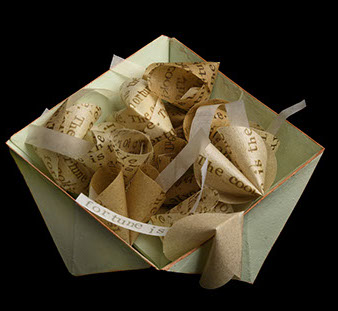
KAREN RUTH KARLSSON
The Cookie is the Fortune, 2021
printmaking and encaustic
6 x 6 x 4.5”
Image use courtesy of the artist
Item 020.030 - Ink Used in Creation of Work
Sale Price (plus tax): $437.00
This piece is one of the artist's ongoing Geomancy series of primarily geometric works incorporating origami forms and encaustic. The Cookie is the Fortune speaks to the all-too-human tendency to rush to the destination withoutappreciating the journey. At the end of a meal in most Chinese restaurants, it is customary to be presented with a fortune cookie - a thin, sugary round wafer folded on itself and holding a tiny slip of paper with a printed prediction, warning, or lucky number. In the rush to get to that fortune, the cookies frequently lie broken and unconsumed on the tabletop. The fact that they have received a free, crunchy, sugary treat is lost on the diners.
The piece is composed of paper circles hand printed with "The fortune is the cookie. The cookie is the fortune," which have been coated with encaustic and formed into cookie shapes with blank (save for one) paper fortunes. The cookies are contained in a paper origami bowl coated with encaustic paint.
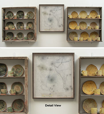
SERIT "SHERI" KOTOWSKI
Sacred Trust: BROKEN, installation, 2019
three-part installation: ceramics, wood, paper, ink, and clay
39 x 103.5 x 6”
Image use courtesy of the artist
Item 021.031 - Combined Use of Ink & Clay
Sale Price (plus tax): $11,250.00
Sacred Trust: BROKEN is an educational installation focusing on the extent of the nuclear weapons industry in New Mexico. This piece is part of an ongoing body of work that began in 2005 to bring awareness to the tragic environmental exploitation and degradation from this industry. Radioactivity is something that can't be identified through sight, smell, or taste, so in many instances, it is the silent enemy. Yes, there is naturally occurring radiation, but I am referring to the kind generated by the production of weapons of mass destruction. This educational body of work is a result of activism, organizing, and findings from collecting data (proof) from environmental studies of contamination in rural communities downwind and downstream from Los Alamos National Laboratory (LANL). LANL is the seat of the Manhattan Project and subsequently the blackest heart of weapons of mass destruction...
MAKO LANSELLE
My Say, 2020
litho
12 x 9”
Image use courtesy of the artist
Item 022.032 - Ink Used in Creation of Work
Sale Price (plus tax): $437.50
Democracy means rule by the people. Voting is the democratic tool for the people to be heard. A vote can take a variety of forms - a show of hands, a mark on a piece of paper, a finger on a touch screen, a simple syllable - "yay" or "nay." The voting might be for one office - national, local - or one issue; or, the ballot might be lengthy and confusing to cover many offices and issues. My image of a hand holding a ballot distills the act of democracy to its essence: one person, one vote. Hear my opinion; this is My Say.
ANDREW LAWSON
Disinformation Playhouse, 2020
etching
24 x 18”
Image use courtesy of the artist
Item 023.034 - Ink Used in Creation of Work
Sale Price (plus tax): $1,750.00
My work illustrates the mediation of the relationship between humans and technology in our theorized post- humanist existence. As material products become a second-tier commodity, the product of information or disinformation becomes the most valued resource. I like to show the dichotomy between nostalgic ideas and objects of our past, with newer trends associated with our dependence upon technology and the future trajectory of our existence. In using narrative and illustrative-based designs, I like to play with the dichotomy of whimsicality and the dark nature of the overall themes of my work. I hope my work engages any regular person walking by and creates questions within the viewer about their own role in our late, image-based capitalist society.
This is an etching of the musical instrument museum in Brussels. This building once was the main department store in the main city square. Signage associated with popular trends in Big-Tech and disinformation decimation adorns the building. This is a commentary about material consumption versus newer trends with popular consumption of information
ANDREW LAWSON
Higher Power, 2021
etching, aquatint
24 x 18”
Image use courtesy of the artist
Item 023.033 - Ink Used in Creation of Work
Sale Price (plus tax): $1,125.00
My work illustrates the mediation of the relationship between humans and technology in our theorized post- humanist existence. As material products become a second-tier commodity, the product of information or disinformation becomes the most valued resource. I like to show the dichotomy between nostalgic ideas and objects of our past, with newer trends associated with our dependence upon technology and the future trajectory of our existence. In using narrative and illustrative-based designs, I like to play with the dichotomy of whimsicality and the dark nature of the overall themes of my work. I hope my work engages any regular person walking by and creates questions within the viewer about their own role in our late, image-based capitalist society.
This is an etching of the vault of the Cathedral of Milan. The stained-glass windows show scenes and motifs associates with consumer trends. This piece is a commentary about how we view the present and past idea of what we see as 'higher powers.'
ANDREW LAWSON
Last Ducky Supper, 2021
etching
14 x 24”
Image use courtesy of the artist
Item 023.035 - Ink Used in Creation of Work
Sale Price (plus tax): $1,250.00
My work illustrates the mediation of the relationship between humans and technology in our theorized post- humanist existence. As material products become a second-tier commodity, the product of information or disinformation becomes the most valued resource. I like to show the dichotomy between nostalgic ideas and objects of our past, with newer trends associated with our dependence upon technology and the future trajectory of our existence. In using narrative and illustrative-based designs, I like to play with the dichotomy of whimsicality and the dark nature of the overall themes of my work. I hope my work engages any regular person walking by and creates questions within the viewer about their own role in our late, image-based capitalist society.
This is an etching that depicts pop culture rubber duckies as the attendees of the last supper, set in a supermarket. This piece is a satirical commentary on popular trends in consumerism and the conditioning of consumer values through things like rubber duckies.
HAESOOK LEE
Old Self II (The Pride of Life), 2019
assemblage (clay, wood, acrylic, paper, letter stickers,...)
34 x 10 x 3”
Image use courtesy of the artist
Item 024.036 - Clay Used in Creation of Work
Sale Price (plus tax): $1,250.00
This work is based on the Bible verse 1 John 2:16, ‘For everything in the world - the lust of the flesh, the lust of the eyes, and the pride of life - comes not from the Father but from the world.’ My monument represents the products I used to pursue and built before I became a Christian. It has been accumulated to protect and enhance my pride in line with worldly values and evaluations such as position and achievements in society; the motivation and sources behind this pursuit are expressed through this work. My art focuses on the state of my heart and the process of transforming my inner self - from my old self to my new self.
My art focuses on finding my personal identity by seeking my true self through the Christian faith. I believe that personal identities are naturally linked to collective or national identities. This work is about the national identity of Korea, my national identity, expressed through things that represent its history and culture. As a first generation Korean immigrant, this piece is based on my interests in Korea, where I grew up and was formed. As a Korean- American, I live in the culture and society of the United States, in the present, and I live with hope in the things of heaven: a better country where I will live forever in the future.
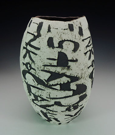
CHRISTOPHER LEITCH
reverse charges, 2018
paper clay with watercolor
40 x 60 x 1”
Image use courtesy of the artist
Item 025.037 - Clay Used in Creation of Work
Sale Price (plus tax): $5,625.00
reverse charges is a work in stoneware started during my residency at Kansas City Art Institute's Center for Contemporary Practice. The text is by Oklahoma poet Larry Bierman and is excerpted from his 1982 chapbook of the same name.
Verbal and visual language occupy space at several abstracted removes from direct, unlimited experience. Naming and describing are important mental efforts as we seek to understand our existence. They are, however, designedly fragmentary and contribute to mistakenly shaping our conceptions of time and space as linear, serial, sequential. Words are eventual, not original. They serve as plastic emblems, iconographic placeholders for impressions of an expansive reality that slyly continues to elide anything like full comprehension.
Larry's poetic phrase alludes to the shared social permission we insist upon in our country to frame ideas and realizations for one another without fear of authoritarian reproach. Yet, he also understands this liberty is circumscribed by the ultimate inscrutability of individual emotional realities and either the undesirability or unnecessity of baring every intimacy.
The work is hand-formed stoneware fired once, painted with gesso and watercolor.
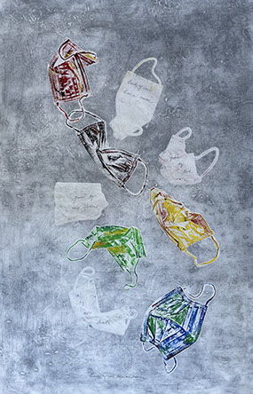
CAROLYN LIESY
Each of Us has a name, ..., 2021
collograph on rice paper, graphite
38 x 25”
Image use courtesy of the artist
Item 026.038 - Ink Used in Creation of Work
Sale Price (plus tax): $1,500.00
I have been asked many times to explain my work, and I do not think there is one explanation that works all the time. I started with photography and ended up with printmaking. I also am a Biologist, and that influences my work. I gravitate to printmaking because I can use it to explore making many kinds of imagery that express a variety of things about what I see and love about the natural world.
My images are experimental, at the margins of traditional printmaking practice. I am interested in composition, love color, and seldom edition my prints. I like to combine different styles of printmaking (etching, relief, lithography) in conceptual ways. I often use text in my work. This approach does not make my work immediately accessible.
Each of Us has a Name. A cascade of masks accompanied by portions of a poem: "Each of us is given a name, given by God, by our desires, by our death." A paean to our sorrow in the pandemic. The blocks where the text is written are masks that imply what or who is no longer with us. The poem was very long, in Hebrew, originally by a woman named Zelda. I have excerpted it.
AMANDA LOVE
Word Matter, 2021
altered books
144 x 120 x 2”
Image use courtesy of the artist
Item 027.039 - Ink Used in Creation of Work
Sale Price (plus tax):
Word Matter addresses the metamorphosis of words and books from explicitly historical, quotidian objects to altered organic matter. Books generate meaning by simply existing in a literate culture and are recognized as a time-based medium. Language paradigms in relation to visual literate systems support the repetition of moving your eyes from left to right, turning the pages in the same pattern. By deconstructing books and reducing their form, contradictions in the formerly known order of the book are revealed. Suspension frees the viewer from traditional interpretations of books and words and offers new ways to decipher meaning in the repeating matter. It is through repetition that new visual systems emerge. Displaced and repeating words, books, bark, rock formations, waves and landscape serve as alternative interpretations of systemic interrelated matter.
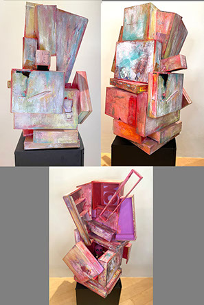
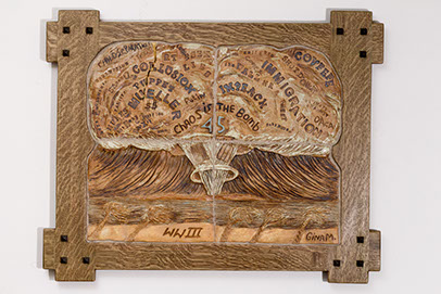
GINA M.
Chaos is the Bomb, 2019
high-fired ceramic, oxide wash, wood, stain
22.25 x 27.5 x 1”
Image use courtesy of the artist
Item 064.094 - Clay Used in Creation of Work
Sale Price (plus tax): $3,125.00
A Craftsman-style oak frame holds four ceramic tiles depicting words circulating in mass media. They float in an atomic bomb's bulging mushroom cloud rising over bent palm trees, referencing the photos from the atomic bomb test sites at the Bikini Atoll and the Marshall Islands between 1946-58.
Chaos is The Bomb captures the disinformation campaign that ramped up in 2016 and started well before the USA presidential election. It now runs rampant throughout the globe, trying to destabilize democracy. There is no need for a bomb when the stock market is affected by a tweet and elections are won with bots and lies. Words are weapons. Two flags sit at the center of the mushroom stem. After the destruction caused by fake news and a reality TV show host, one asks the question, "Who will set up the new world order?"
CONNIE MAJOR
Opened?, 2017
clay, high fire underglazes
12.5 x 12.5 x 4”
Image use courtesy of the artist
Item 028.040 - Clay Used in Creation of Work
Sale Price (plus tax): $1,250.00
Opened? is a large wheel-thrown plate that appears to be ripped open at the bottom to find it is made of cardboard, which was detailed by hand to create a trompe l'oeil illusion. It is skillfully done in both image and color to bring the famous baking soda box to mind. One might note that the instructions are to "Open at the top," obviously ignored. This sculpture requires a moment to ponder.
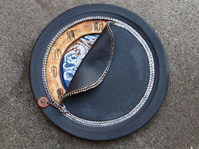
CONNIE MAJOR
Closing In On The Eleventh Hour, 2018
clay, low and high fire underglazes and glazes, silver luster
14 x 14 x 3”
Image use courtesy of the artist
Item 028.041 - Clay Used in Creation of Work
Sale Price (plus tax): $1,250.00
Clay is clean dirt, and I love to play in it.
Closing In On The Eleventh Hour is a large wheel-thrown plate that was then manipulated and added to in the trompe l'oeil method. The silver zipper is quite realistic and is closing on the world with some of a clock face still exposed. As the zipper closes, the world is covered in blackness. There is very little time to save the world as we approach the eleventh hour.
M. ROBERT MARKOVICH
Gun Show 015, From the Series:
Gun Show/Collateral Damage, 2020
archival pigment print
24 x 36 x 1”
Image use courtesy of the artist
Item 065.095 - Ink Used in Creation of Work
Sale Price (plus tax): $750.00
Text-based project referencing accidental gun violence among children, families, and friends. Initially begun after finding very small articles in the middle sections of newspapers regarding gun violence and children; eventually, the articles disappeared, but the violence did not. Now the articles are found mostly online at various local news sites. The project is ongoing.
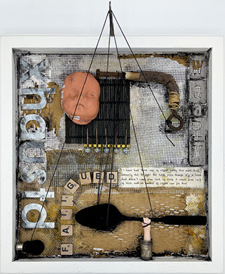
MONICA MARKS
Xhaustd, 2021
mixed media collage
16 x 15 x 5”
Image use courtesy of the artist
Item 029.042 - Combined Use of Ink & Clay
Sale Price (plus tax): $500.00
Caregivers often give so much of themselves they have little energy for self-care. Mothers with special needs children, especially during the pandemic, experienced a kind of exhaustion they never felt before.
MONICA MARKS
After The Pandemic, 2021
mixed media collage
15 x 16 x 5”
Image use courtesy of the artist
Item 029.096 - Combined Use of Ink & Clay
Sale Price (plus tax): $500.00
As much as everyone has been looking forward to ‘after’ the pandemic, many experience trepidations, even anxiety, at the prospect of venturing out. The need for reinstatement of self-boundaries is paramount; when the doorbell rings, we may not be ready to answer. The text on the mother figure is made of quotes stated during a meeting of artist mothers expressing their feelings regarding the transition to the new normal.
SHAHIN T. MASSOUDI
Self portrait, 2020
ink
22 x 17 x 0.5”
Image use courtesy of the artist
Item 030.044 - Ink Used in Creation of Work
Sale Price (plus tax): $1,250.00
The intimacy and specificity of any single woman's struggle can feel in conflict with the global scope of misogyny and sexism. Inspired by the continuous perseverance of women in my homeland of Iran - alongside women all around the world. I strive to see myself in them and them in myself. The poem (Calligraphy) is from my favorite Persian poet, Sohrab Sepehri:
I am full of wings and feathers.
I am full of light.
I am full of loneliness.
SHAHIN T. MASSOUDI
Poetic, poetry, poem, pottery, 2017
ceramic
10 x 12 x 7”
Image use courtesy of the artist
Item 030.044 - Ink Used in Creation of Work
Sale Price (plus tax): $1,187.50
Iranian poetry is a source of inspiration for much of my work. The color and form of this work comes from the poem inscribed on its surface (my own translation): “Where I rest my head is full with the song of swallows' wings.”
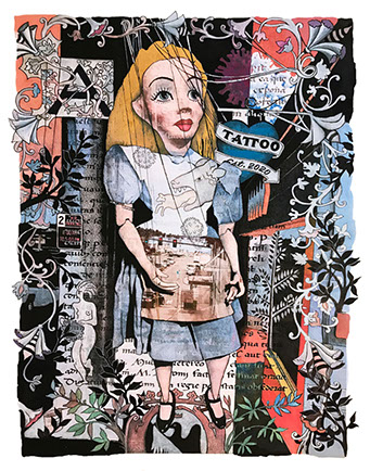
BABETTE MAYOR
Alice is Only a Puppet—from "Life Out of Balance" series, 2021
digital mixed media monoprint with colored pencils and gouache
22 x 17”
Image use courtesy of the artist
Item 031.045 - Ink Used in Creation of Work
Sale Price (plus tax): $1,500.00
Alice is Only a Puppet represents the invisible double of the human from a dual perspective: the positive side freed from the gravity of matter; the negative side revealing the mind's hidden impulses and torment of manipulation.
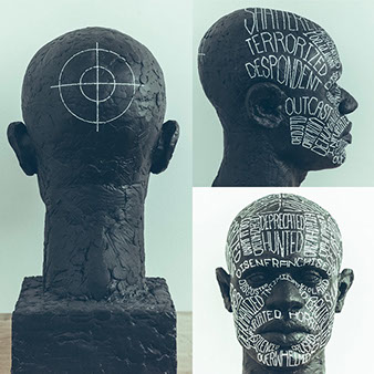
JASON MCCORMACK
A Marked Man, 2018
sculpted in clay, casted in aqua resin,
ink hand-lettering.
30 x 19 x 17”
Image use courtesy of the artist
Item 032.046 - Combined Use of Ink & Clay
Sale Price (plus tax): $43,750.00
Must one be Black or Brown to care? This is one of the self-imposed questions that led me to create A Marked Man back in 2018.
Must one be Black or Brown to care? This is one of the self-imposed questions that led me to create A Marked Man back in 2018.
It's hard for me not to feel like a marked man when the very people sworn to protect are executing countless murders of unarmed men and women who look like my aunts, my uncles, my brothers, my cousins, my neighbors, and me. Every one of these murders feels like a threat. The victims did nothing to justify being killed. The one commonality is the hue of their skin, which designates them and me to the lowest rung of our American caste system- make no mistake, what we call ‘race’ operates as a caste system in America. And in this caste system, my life is worth bullets, so Black people get all the bullets they can - or can't - stand. One must simply see the countless unarmed Black people being murdered while driving, walking, running, sleeping, and breathing to realize there's a crisis at hand. Feeling strongly that we in America need to have this conversation, I decided the only way to start would be through the truth. My truth.
A Marked Man is a self-portrait of my physical and inner self. Even at 6'2", 210lbs, the threat I feel is omnipresent. Despite what America has taught you to think of me, the reality is that I am the hunted. I needed to be totally vulnerable and honest in sharing this reality with those who may not be able to relate. If they could literally see what I feel, then maybe they could feel it too, or at least feel safe asking me questions in a conversation I had started. We must be willing to have these conversations. Our futures may depend on it.
SARAH MEYER
24, 2021
letterpress and offset lithography
12 x 10 x 1.25”
Image use courtesy of the artist
Item 033.049 - Ink Used in Creation of Work
Sale Price (plus tax): $312.50
Typography, the art of type, takes into consideration the style, arrangement, and appearance of typographic matter. Typography enhances our everyday lives giving us information that is both implicit and explicit. In a cityscape, typography is an enigmatic thing, both old and new, simultaneously. Taken out of context, typography can become more confusing or more informative. Simplifying the noise of the environment in which the type is placed can enhance or detract from its original intent. It is this juxtaposition of intent and usage that influences my work.
In this body of work, typographic specimen books are used to constrain the writing. Constrained writing is a literary technique in which the author sets new parameters and rules to follow. For example, changing the order of words creates new meaning; and as contradictory as it may seem, two things always go together. Therefore, only the words and phrases included on one font specification sheet from the 1923 edition of the American Type Founders Specimen Book and Catalog were used to create the poetry.
A letterpress and all of its components are the media by which the poem is brought to form. Working in the method of the great pressman, H.N. Werkman, the make-ready, brayer, and ghost image of inked type as well as the foot, groove, and nick of the type enhance the communication. Rubber bands, bolts, and hardware are inked to create depth and meaning to the form. Make ready, waste paper and specimen sheets are collaged to add texture, and each unique print uses the opacity and reverse print to bring implicit depth to the content.
SARAH MEYER
25, 2021
letterpress and offset lithography
12 x 10 x 1.25”
Image use courtesy of the artist
Item 033.048 - Ink Used in Creation of Work
Sale Price (plus tax): $312.50
Typography, the art of type, takes into consideration the style, arrangement, and appearance of typographic matter. Typography enhances our everyday lives giving us information that is both implicit and explicit. In a cityscape, typography is an enigmatic thing, both old and new, simultaneously. Taken out of context, typography can become more confusing or more informative. Simplifying the noise of the environment in which the type is placed can enhance or detract from its original intent. It is this juxtaposition of intent and usage that influences my work.
In this body of work, typographic specimen books are used to constrain the writing. Constrained writing is a literary technique in which the author sets new parameters and rules to follow. For example, changing the order of words creates new meaning; and as contradictory as it may seem, two things always go together. Therefore, only the words and phrases included on one font specification sheet from the 1923 edition of the American Type Founders Specimen Book and Catalog were used to create the poetry.
A letterpress and all of its components are the media by which the poem is brought to form. Working in the method of the great pressman, H.N. Werkman, the make-ready, brayer, and ghost image of inked type as well as the foot, groove, and nick of the type enhance the communication. Rubber bands, bolts, and hardware are inked to create depth and meaning to the form. Make ready, waste paper and specimen sheets are collaged to add texture, and each unique print uses the opacity and reverse print to bring implicit depth to the content.
SARAH MEYER
23, 2021
letterpress and offset lithography
12 x 10 x 1.25”
Image use courtesy of the artist
Item 033.047 - Ink Used in Creation of Work
Sale Price (plus tax): $312.50
Typography, the art of type, takes into consideration the style, arrangement, and appearance of typographic matter. Typography enhances our everyday lives giving us information that is both implicit and explicit. In a cityscape, typography is an enigmatic thing, both old and new, simultaneously. Taken out of context, typography can become more confusing or more informative. Simplifying the noise of the environment in which the type is placed can enhance or detract from its original intent. It is this juxtaposition of intent and usage that influences my work.
In this body of work, typographic specimen books are used to constrain the writing. Constrained writing is a literary technique in which the author sets new parameters and rules to follow. For example, changing the order of words creates new meaning; and as contradictory as it may seem, two things always go together. Therefore, only the words and phrases included on one font specification sheet from the 1923 edition of the American Type Founders Specimen Book and Catalog were used to create the poetry.
A letterpress and all of its components are the media by which the poem is brought to form. Working in the method of the great pressman, H.N. Werkman, the make-ready, brayer, and ghost image of inked type as well as the foot, groove, and nick of the type enhance the communication. Rubber bands, bolts, and hardware are inked to create depth and meaning to the form. Make ready, waste paper and specimen sheets are collaged to add texture, and each unique print uses the opacity and reverse print to bring implicit depth to the content.
GAIL MILES
Going Across The Sea, 2021
clay
11 x 6.5 x 3.25”
Image use courtesy of the artist
Item 034.050 - Combined Use of Ink & Clay
Sale Price (plus tax): $187.50
This piece, like the song lyrics, is meant to evoke a ship, timelessness, travel, the wind, and the ocean. The words are lyrics to an old public domain bluegrass song called "I'm Going Across the Sea" from the 1800s. The song and the piece speak to longing and love. Hope and sadness. Beauty and time.
I'm going across the sea. Stay forever more.
Won't you come and go. Come and go with me.
Fly to me, my pretty little miss. I'm going across the sea.
Wind is howling low. Wind is howling high.
Hand-built vessel. Made from Black Mountain clay, brushed and washed with white porcelain slip. The lyrics are a custom rice paper transfer printed in black underglaze. The interior is hand brushed teal and clear glazes. Cone 10 gas reduction.
GAIL MILES
Dancing on the Sunnyside, 2021
Black Mountain clay, hand-built vessel
6.5 x 8.5 x 2.75”
Image use courtesy of the artist
Item 034.051 - Combined Use of Ink & Clay
Sale Price (plus tax): $187.50
This piece is a dancing, moving sculptural vessel. Its coil is built from a rich deep clay called Black Mountain.
The lyrics are "Keep On The Sunny Side," an old bluegrass song that speaks to trouble, clouds, storms, and also hope, triumph, and "the sunny side." The piece looks old, weather-worn, and sun-beaten yet also lyrical, happy, and whimsical.
There's a dark and a troubled side of life,
there's a bright and a sunny side too,
tho' we meet with the darkness and strife,
the sunny side we also may view.
Keep on the sunny side,
always on the sunny side,
Keep on the sunny side of life.
It will help us every day,
it will brighten all the way,
if we'll keep on the sunny side of life.
Hand-built vessel. Made from Black Mountain clay, brushed and washed with white porcelain slip. The lyrics are a custom rice paper transfer printed in black underglaze. Unglazed. Cone 10 gas reduction.
JOY NAGY
‘Give me your tired' from the The New Colossus series, 2020
white porcelain clay and paper QR code, sixteen translations
in various languages
approx. 11 x 7.5 x 0.25” each
Image use courtesy of the artist
Item 035.052/54 - Combined Use of Ink & Clay
Sale Price (plus tax): $2,500.00 ea.
This body of work began with thoughts of my grandmother, who, as a lone teenager, immigrated from Hungary. I wondered who stood by her side and translated Emma Lazarus's “The New Colossus” poem to her when her passenger ship entered New York Harbor and viewed The Statue of Liberty:
Give me your tired, your poor, your huddled masses, yearning to breathe free.
The wretched refuse of your teeming shores.
Send these homeless, tempest-tossed to me.
I lift my lamp beside the golden door.
The combined written word on clay is not a particularly unique notion –the uniqueness of this project is the message it conveys. The translation of a portion of a single poem is made by translators with a mutual dream for a better life in the United States of America. It is my intention to open a portal to vision, form, and dimension with words, to impact and encourage others to take note of the richness of the community that surrounds them.
To observe the richness and diversity of the many cultures that have entered the United States, I transcribed this portion of “The New Colossus” onto porcelain clay in twenty-five languages provided by friends and acquaintances, sixteen of which you see displayed here. These unique slip-cast porcelain pieces represent seven decades of immigration between the years 1950-2013. Each of the 7.5 x 11" crumpled fragile porcelain letters references the tenuous time we live in. Individual porcelain pieces are accompanied by a QR code link to a voice translation of each language.
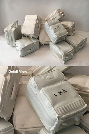
JOY NAGY
Fragile Cargo installation, 2021
white porcelain clay-individual suitcase
6.5 x 5 x 3.35”
Image use courtesy of the artist
Item 035.053 - Combined Use of Ink & Clay
Sale Price (plus tax): $6,250.00
America's port of entry has changed. Immigrants no longer travel to our country via passenger ships, or come through Ellis Island for processing into our country. To signify this change in procedures, an array of miniature white porcelain suitcases commemorates travel during the late 20th-21st century, and the plight of today's immigrant.
MARIE NAGY
Voices, 2021
porcelain
35 x 45 x 28”
Image use courtesy of the artist
Item 036.055 - Clay Used in Creation of Work
Sale Price (plus tax): $1,500.00
We are constantly exposed to people, be they friends, the internet, influences, celebrities, writers, or politicians. Between all those voices from time immemorial occasionally drops a nice moment of wisdom worth preserving, thinking about, and even repeating. However, often those statements get lost and overwhelmed by all the other voices we are surrounded by. I have chosen to preserve at least some of that wisdom & ideas using one of the more permanent medium known to man. And yet, I fully expect some statements to get lost in the crowd, and not all will be read. But that is fine. As long as you read even one, I have done my job.
MARIE NAGY
IN VINO VERITAS, 2021
stoneware
12.5 x 45 x 9”
Image use courtesy of the artist
Item 036.056 - Clay Used in Creation of Work
Sale Price (plus tax): $562.50
In Vino Veritas. In wine truth. The last administration has essentially introduced itself with the phrase “We have alternate facts.” on January 22, 2017.
Drunks do not always remember what they said while under influence. And people often get drunk on power. Since the now infamous phrase was introduced, facts became unstable, falling like bowling pins. But as time went on and the amount of questionable information kept growing, I kept thinking of this piece more like 99 bottles on the wall. With the help of internet and even TV networks there is now little left of which we are certain and on which most of us can agree. Thus not many bottles are left on the wall.
MICHAEL PAIEDA
EXIT, 2020
ink
30 x 19”
Image use courtesy of the artist
Item 038.058 - Ink Used in Creation of Work
Sale Price (plus tax): $2,500.00
EXIT is a portrait of a cheap apartment building, either a place of opportunity or one of last resort. It's the place where people go as a way station in their search for more. It's a place of hopes and dreams, a step on the way to something better. It's the sound of kids playing in the hallway, the smell of food cooking, neighbors coming and going, living their lives. But for some, it's the last stop. A place to rest and wait out the time that's left. A TV is on in the middle of the night. The traffic sounds coming in through open windows during the hot summer months. It's the place where no one wants to end up.
JANE PALLICCIOTTO
Roman Arches Brooch, 2021
polymer clay, nickel-plated pin clutch
3.125 x 3.125 x 0.125”
Image use courtesy of the artist
Item 039.059 - Combined Use of Ink & Clay
Sale Price (plus tax): $406.25
Car tracks in the snow like calligraphic swoops. An empty sign marquee framing the sky. The graphic pattern is found in the foundation of ancient ruins. These and other mundane forms, patterns, and textures capture my attention and ask to be translated into a new form, one that is wearable. What these things share are impermanence and unevenness, a sense of serendipity. We cling to the idea of control and perfection, but these are imaginary and unattainable.
I try in my work to celebrate the slightly broken beauty in the world and in ourselves. There is irony in trying to capture the temporal and imperfect and make it precious in the form of jewelry. I often take life a bit too seriously. By making bold, asymmetrical, playful jewelry, I invite myself and others to cast off restrictive notions about life.
As I'm sure many people are doing as the pandemic nears its end, I'm musing about travel. I dig into folders of images for something to take me away. That place was Italy.
My work tends to be bold and colorful, using simple forms. But I'm enamored of ancient places, and especially when sleek and modern contrasts with crumbling and ancient. In Rome and other Italian cities, chunks of antiquity are often preserved and displayed in surprisingly contemporary ways. A vibrant orange wall studded with a single broken capital from a column. The unexpected context makes us reflect differently on a past that might not be so different from our present.
With this brooch, I combine stylized overlapping arch forms with a charming bit of marble-engraved text from the Basilica of Our Lady in Trastevere in Rome, my own way of preserving antiquity in a new context.
JANE PALLICCIOTTO
Type Collage Brooch, Gold and Orange, 2021
polymer clay, gold powder, image transfer
3.75 x 1 x 0.125”
Image use courtesy of the artist
Item 039.061 - Combined Use of Ink & Clay
Sale Price (plus tax): $406.25
Car tracks in the snow like calligraphic swoops. An empty sign marquee framing the sky. The graphic pattern is found in the foundation of ancient ruins. These and other mundane forms, patterns, and textures capture my attention and ask to be translated into a new form, one that is wearable. What these things share are impermanence and unevenness, a sense of serendipity. We cling to the idea of control and perfection, but these are imaginary and unattainable.
I try in my work to celebrate the slightly broken beauty in the world and in ourselves. There is irony in trying to capture the temporal and imperfect and make it precious in the form of jewelry. I often take life a bit too seriously. By making bold, asymmetrical, playful jewelry, I invite myself and others to cast off restrictive notions about life.
When I used to teach graphic design, one of my favorite typography projects to assign students was abstract letterform compositions. Cutting up and rearranging letterforms allows for appreciation of positive/negative space and the sensual or rigid forms of letters. It forced students to study the specific shapes of letters without the distraction of meaning.
All these years later, I've embarked on a series of wearable type collages in that same spirit. The process involves ink toner applied to polymer clay in its uncured (unbaked) form, removing the paper to leave only the image. I add dimension and contrast with bits of colored clay that mirror some of the accidental cut-up letters.
In this brooch, transparent clay as the canvas creates an extra element of dimension.
Perhaps the viewer tries to decipher the letters, even though there's nothing to figure out, only appreciating the forms.
JANE PALLICCIOTTO
Type Collage Pendant, Gray, Red, Gold, 2021
polymer clay, brass, sterling silver, image transfer
3.75 x 2 x 0.125”
Image use courtesy of the artist
Item 039.060 - Combined Use of Ink & Clay
Sale Price (plus tax): $431.25
Car tracks in the snow like calligraphic swoops. An empty sign marquee framing the sky. The graphic pattern is found in the foundation of ancient ruins. These and other mundane forms, patterns, and textures capture my attention and ask to be translated into a new form, one that is wearable. What these things share are impermanence and unevenness, a sense of serendipity. We cling to the idea of control and perfection, but these are imaginary and unattainable.
I try in my work to celebrate the slightly broken beauty in the world and in ourselves. There is irony in trying to capture the temporal and imperfect and make it precious in the form of jewelry. I often take life a bit too seriously. By making bold, asymmetrical, playful jewelry, I invite myself and others to cast off restrictive notions about life.
When I used to teach graphic design, one of my favorite typography projects to assign students was abstract letterform compositions. Cutting up and rearranging letterforms allows for appreciation of positive/negative space and the sensual or rigid forms of letters. It forced students to study the specific shapes of letters without the distraction of meaning. All these years later, I've embarked on a series of wearable type collages in that same spirit. The process involves ink toner applied to polymer clay in its uncured (unbaked) form, removing the paper to leave only the image. I add dimension and contrast with bits of colored clay that mirror some of the accidental cut-up letters.
Perhaps the viewer tries to decipher the letters, even though there's nothing to figure out, only appreciating the forms. But in attempting to, a more intimate dialog is created between the wearer and the viewer.
LUCIANO PIMIENTA
100 Dollars on a String, 2021
terra-cotta on paper, string, and tape
2.25 x 6 x 2.5”
Image use courtesy of the artist
Item 040.063 - Clay Used in Creation of Work
Sale Price (plus tax): $625.00
My work explores dualities and the space found in the in-between. I am interested in the ephemeral, the natural world, and the seemingly permanent aspects of history. I use iconography linked to my experiences to explore the complexity found in what it means to be ’American.’
I use materials such as seeds, leaves, and clay as symbols for truth/healing, which I connect to the human condition. Nature becomes a collaborator as drying leaves curl or cut plants callous showing the passing of time. Re-creating images, objects, and memories allow me to look deeper at their significance to the ‘what’ and ‘why’ of Americanness.
Using personal narratives as a starting point for sculptures and time-based installations, I investigate themes of memory, desire, and healing. I am looking at inheritance across family generations. For example, the inherited belief of using labor as a tool for achieving dreams. Deciphering between the inherited, the acquired, and the imposed is where my work currently lies.
LUCIANO PIMIENTA
Biyuyo de 50, 2020
terra-cotta and wax
7.5 x 8 x 15”
Image use courtesy of the artist
Item 040.062 - Clay Used in Creation of Work
Sale Price (plus tax): $1,250.00
My work explores dualities and the space found in the in-between. I am interested in the ephemeral, the natural world, and the seemingly permanent aspects of history. I use iconography linked to my experiences to explore the complexity found in what it means to be ’American.’
I use materials such as seeds, leaves, and clay as symbols for truth/healing, which I connect to the human condition. Nature becomes a collaborator as drying leaves curl or cut plants callous showing the passing of time. Re-creating images, objects, and memories allow me to look deeper at their significance to the ‘what’ and ‘why’ of Americanness.
Using personal narratives as a starting point for sculptures and time-based installations, I investigate themes of memory, desire, and healing. I am looking at inheritance across family generations. For example, the inherited belief of using labor as a tool for achieving dreams. Deciphering between the inherited, the acquired, and the imposed is where my work currently lies.
LUCIANO PIMIENTA
Three Ways to Make 50 Dollars, 2020
terra-cotta on paper
29 x 69”
Image use courtesy of the artist
Item 040.064 - Clay Used in Creation of Work
Sale Price (plus tax): $1,250.00
My work explores dualities and the space found in the in-between. I am interested in the ephemeral, the natural world, and the seemingly permanent aspects of history. I use iconography linked to my experiences to explore the complexity found in what it means to be ’American.’
I use materials such as seeds, leaves, and clay as symbols for truth/healing, which I connect to the human condition. Nature becomes a collaborator as drying leaves curl or cut plants callous showing the passing of time. Re-creating images, objects, and memories allow me to look deeper at their significance to the ‘what’ and ‘why’ of Americanness.
Using personal narratives as a starting point for sculptures and time-based installations, I investigate themes of memory, desire, and healing. I am looking at inheritance across family generations. For example, the inherited belief of using labor as a tool for achieving dreams. Deciphering between the inherited, the acquired, and the imposed is where my work currently lies.
LINDA RA
Badass Espresso Mug - Carved, 2019
clay
3 x 2.75 x 2.75”
Image use courtesy of the artist
Item 041.065 - Clay Used in Creation of Work
Sale Price (plus tax): $68.75
My ceramic work is functional, minimal in form, and hand-crafted with graphic details. Feel-good words or 90's nostalgic elements I've cherished are displayed in bold, illustrative hand-drawn or hand-carved typography.
Influenced by the deeply treasured "blind emboss" treatment in the graphic and print world, you will see this fondness expressed in my carved ceramic piece as a blind emboss texture on clay. The tactile quality is expressed in raised letterforms on a single colored clay containing a bold message: "BADASS". Empowerment is expressed in the subtlety as you start or end your day with your BADASS mug.
BRIAN ROW
Don't Dump Your Shit On Me!, 2018
claybord, Hydrocal claybord solution, pasta
4.5 x 9 x 9”
Image use courtesy of the artist
Item 042.066 - Clay Used in Creation of Work
Sale Price (plus tax): $1,250.00
At times our loving parents try to pass on or show their inhumanity, indifference, intolerance, and indulgences. All I am asking you to do is to think about it but, Don’t Dump Your Shit On Me!
MICK SCHOON
Die-betes, 2021
clay
17 x 19 x 7”
Image use courtesy of the artist
Item 043.067 - Combined Use of Ink & Clay
Sale Price (plus tax): $375.00
This piece was inspired by early 2000's pharmaceutical advertisements. The cartoonish aesthetics can mask serious side effects. Die-abetes is an exploration and documentation of my struggles with diabetes and its monetary side effects. It shows the struggles between affording to maintain my health or rent. The cartoonish aesthetic is fun and inviting; however, it is much darker and sad upon further look.
NANCI SCHRIEBER-SMITH
Octopus (three views ) (from the Animal Tales Series), 2021
mixed media sculpture
10 x 8.5 x 10.5”
Image use courtesy of the artist
Item 044.068 - Ink Used in Creation of Work
Sale Price (plus tax): $612.50
In the ANIMAL TALES series, I join my love of stories and my love of animals with my compulsion to give new form and new meaning to the discards of our civilization. OCTOPUS:
What better animal from my Animal Tales series to submit to the Ink and Clay 45 than this natural ink producer! The repurposed book - Octopus, a factual Natural History by Mather, Anderson, and Wood is manipulated so that the printed type becomes a textural pattern floating behind the drawn image. Sheet glass from a repurposed picture frame is resized to fit the book. The front of the piece of glass is hand-drawn using glass/porcelain paint which is kilnfired into the glass. The reverse side is painted in acrylic for color. The painted glass image is then permanently affixed to the book. Handmade glass beads and shells adorn the piece and the base.
FUN FACTS ABOUT THE OCTOPUS:
• The Octopus does NOT have tentacles. They have 8 arms.
• The plural of Octopus is NOT Octopi. The plural is octopod.
• Because they have no skeleton, they can manage to fit themselves into tiny holes or crevasses.
• Octopus ink is toxic even to the octopus itself.
ANITA SELTZER
Hamlet's Dilemma-To B, or not to B, 2019
photopolymer intaglio etching -
19.25 x 15.25”
Image use courtesy of the artist
Item 045.069 - Ink Used in Creation of Work
Sale Price (plus tax): $843.75
We are surrounded and bombarded by color, but the tonality of a monochromatic print has the power to stop us in our tracks. The unsaturated images command our attention because shape, form, texture, context, and the play of light and shadow are simplified with sharpness and freshness. They enable us to focus on the subject. They are ‘easy’ on the eye.
Photographic images are transformed by Seltzer into "one at a time" intaglio inked etchings that don't utilize altered reality manipulations. And the prints can't be mechanically mass-produced with the stroke of a computer key.
Etchings have been created for centuries by the world's greatest artists. The use of non-toxic photopolymer plates brings the intaglio tradition into the 21st Century.
I came upon a letterpress tray that had been prepared for printing and laughed out loud as I immediately saw an unintentional visual pun: the Shakespearean text, as a set, gave new meaning to the prose within Hamlet's soliloquy. Hahnemühle Copperplate paper, Akua Ink, Charles Brand press.
SUZANNE SIZEBOTTOM
Story of Mankind, 2020
porcelain clay, underglazes, ceramic decals
2 x 10.5 x 10”
Image use courtesy of the artist
Item 046.071 - Clay Used in Creation of Work
Sale Price (plus tax): $750.00
Is it real, or is it a trick of the eye? To a casual observer, my sculptures appear real - combinations of books and boxes, completed with additions of crossword puzzles, newspaper clippings, paintbrushes, stamps, postcards, a pencil, or even old nails. In reality, they are still-life sculptures created from porcelain slabs that are manipulated, molded, and printed upon.
The sculptures force me to use every tool in my ‘mental clay toolbox’ to determine how I can best produce a sculpture that appears real to the viewer. Sometimes that means, rolling clay slabs across paper to produce a paper-like texture. Other times it means rolling slabs on a piece of wood, making a clay template to produce the center layer of a piece of cardboard, or using a particular surface to roll out a leather-like texture on a slab. The text comes from antique stamps or rubber stamps that I design and make. These stamps are inked with underglazes and printed on raw clay. Other methods of producing two-dimensional text and images are through artist-made decals that are applied and fired onto the clay. All of these methods require multiple firings, sometimes as many as five or six firings. Most completed art pieces feature a combination of printed, pressed, and applied textures and texts.
Trompe l'oeil is an art of illusion, a game, artists play with viewers to raise questions about the nature of art and perception. The challenge of making clay objects appear real, forces me to question how to make the viewer believe the artwork is real when they are made of clay. I want the viewer to interact with my pieces - touch them, feel them, and take a second glance. What you feel when you view my sculptures is not what you see... ‘It's clay.’
SUZANNE SIZEBOTTOM
Psyche of the Palette, 2020
porcelain clay, color decals, underglazes
3 x 12 x 12”
Image use courtesy of the artist
Item 046.097 - Clay Used in Creation of Work
Sale Price (plus tax): $1,000.00
Is it real, or is it a trick of the eye? To a casual observer, my sculptures appear real - combinations of books and boxes, completed with additions of crossword puzzles, newspaper clippings, paintbrushes, stamps, postcards, a pencil, or even old nails. In reality, they are still-life sculptures created from porcelain slabs that are manipulated, molded, and printed upon.
The sculptures force me to use every tool in my ‘mental clay toolbox’ to determine how I can best produce a sculpture that appears real to the viewer. Sometimes that means, rolling clay slabs across paper to produce a paper-like texture. Other times it means rolling slabs on a piece of wood, making a clay template to produce the center layer of a piece of cardboard, or using a particular surface to roll out a leather-like texture on a slab. The text comes from antique stamps or rubber stamps that I design and make. These stamps are inked with underglazes and printed on raw clay. Other methods of producing two-dimensional text and images are through artist-made decals that are applied and fired onto the clay. All of these methods require multiple firings, sometimes as many as five or six firings. Most completed art pieces feature a combination of printed, pressed, and applied textures and texts.
Trompe l'oeil is an art of illusion, a game, artists play with viewers to raise questions about the nature of art and perception. The challenge of making clay objects appear real, forces me to question how to make the viewer believe the artwork is real when they are made of clay. I want the viewer to interact with my pieces - touch them, feel them, and take a second glance. What you feel when you view my sculptures is not what you see... ‘It's clay.’
SUZANNE SIZEBOTTOM
Pieces of Peace, 2021
porcelain clay, underglazes
5 x 16 x 16”
Image use courtesy of the artist
Item 046.070 - Clay Used in Creation of Work
Sale Price (plus tax): $2,250.00
Is it real, or is it a trick of the eye? To a casual observer, my sculptures appear real - combinations of books and boxes, completed with additions of crossword puzzles, newspaper clippings, paintbrushes, stamps, postcards, a pencil, or even old nails. In reality, they are still-life sculptures created from porcelain slabs that are manipulated, molded, and printed upon.
The sculptures force me to use every tool in my ‘mental clay toolbox’ to determine how I can best produce a sculpture that appears real to the viewer. Sometimes that means, rolling clay slabs across paper to produce a paper-like texture. Other times it means rolling slabs on a piece of wood, making a clay template to produce the center layer of a piece of cardboard, or using a particular surface to roll out a leather-like texture on a slab. The text comes from antique stamps or rubber stamps that I design and make. These stamps are inked with underglazes and printed on raw clay. Other methods of producing two-dimensional text and images are through artist-made decals that are applied and fired onto the clay. All of these methods require multiple firings, sometimes as many as five or six firings. Most completed art pieces feature a combination of printed, pressed, and applied textures and texts.
Trompe l'oeil is an art of illusion, a game, artists play with viewers to raise questions about the nature of art and perception. The challenge of making clay objects appear real, forces me to question how to make the viewer believe the artwork is real when they are made of clay. I want the viewer to interact with my pieces - touch them, feel them, and take a second glance. What you feel when you view my sculptures is not what you see... ‘It's clay.’
REBECCA SPILECKI
A Common Thread, 2020
relief print
20 x 16”
Image use courtesy of the artist
Item 066.098 - Ink Used in Creation of Work
Sale Price (plus tax): $325.00
My favored art-making practices are printmaking and sculpture, wherein I experiment with the myriad media and methodologies concomitant with each. Thematic arcs in my work tend to vary depending on said media, but language is an element I find to be especially malleable, unbound by either motif or medium. In my print, papermaking, and watermarking work, I often experiment by layering seen and unseen text, exploring the various shades of meaning which can be derived from said text and its sometimes very literal subtext. Working with text overall, I look at the boundary between language and imagery: attempting to find where the resonance of image or object may be amplified by a thoughtful phrase or where the communicative power of words can be crowded out by a more visual, visceral experience.
Recently, I've been exploring frameworks and viewpoints-both literally, as in series involving windows and gates, but also figuratively, investigating structures of oppression, power, and privilege. In print, I look at a wide array of social justice concerns regarding everything from race to reproductive battles to trans rights. In sculpture, this tends to be more centered on explorations of the female body, often focusing on reproduction, maternity, or deliberate materiality. I lean towards solidity in physicality, towards intimate but largely asexual portrayals, frank and often unpretty. Despite this, though, I simultaneously refuse to ground myself too firmly in practical reality, instead choosing either mythologizing the norm or norming the mythological, exploring the limits of that liminality and striving not to hem too close to either disparate pole. This remains the case whether the mythology involved relates to the ancient stories I loved consuming as a child-or if it pertains to the more modern one in which I was raised. When portraying the reality of the imperfect human figure, I want to counter the exhaustion of the everyday by offering a tinge of situational unreality in order to reassert the boundlessness and semi-mystically of psychological existence even within a typically disdained or ignored form. In those moments I do leave behind the body, I turn instead often to creatures unreal or extinct, trying still to ground them and offer them quieter, somehow still relatable life.
Ceramic is central to my sculptural endeavors; the fact of literal earth is, in itself, grounding. Still, much of my recent work has been with polymer clays. I've been capitalizing on their wide range of colors, but more importantly, I've been able to explore their literal greater plasticity, increased flexibility, and longer untreated open time to experiment with the pliability of human expressiveness. I hope to translate these exercises back to traditional clay, allowing for deeper investment in the aforementioned psychological tableau, richer selves within physical forms rife with detailed extremities and body rolls, reaffirming personhood and value in figures and choices which are consistently societally undervalued, demeaned, or degraded.
JANE SPRINGWATER
Just In Time, 2016
48 x 48 x 2”
Image use courtesy of the artist
Item 047.072 - Ink Used in Creation of Work
Sale Price (plus tax): $9,000.00
I find meaning through understanding the order and structure of things. Visual order expresses relationships; in some cases, mathematical and mechanical, in others, natural and organic. In pursuing this interest, my work incorporates elements of both free-flowing and highly structured expression. I establish a set of rules that then governs the repetition of marks and gestures. I investigate the potential of these systems to generate intricate patterns and unexpectedly evocative forms. My goal is to slow time for the viewer and encourage extended studies both close up and from afar, in a quest for quietude and contemplation and thoughtful response from the viewer.
This drawing is part of my Decelerating Series, which involves repetitive mark-making according to a set of rules I devised using a single element or 'particle' of form -- like a handwritten character or an invented glyph. The marks scrawl across
JANE SPRINGWATER
Time Interval, 2021
drawing; ink on paper
53 x 40 x 2”
Image use courtesy of the artist
Item 047.073 - Ink Used in Creation of Work
Sale Price (plus tax): $9,000.00
I find meaning through understanding the order and structure of things. Visual order expresses relationships; in some cases, mathematical and mechanical, in others, natural and organic. In pursuing this interest, my work incorporates elements of both free-flowing and highly structured expression. I establish a set of rules that then governs the repetition of marks and gestures. I investigate the potential of these systems to generate intricate patterns and unexpectedly evocative forms. My goal is to slow time for the viewer and encourage extended studies both close up and from afar, in a quest for quietude and contemplation and thoughtful response from the viewer.
This drawing is part of my Decelerating Series, which involves repetitive mark-making according to a set of rules I devised using a single element or 'particle' of form -- like a handwritten character or an invented glyph. The marks scrawl across
CARYL ST. AMA
Speak Truth To Power, 2018
rubbing (graphite encaustic paint) with encaustic monotype
22 x 14”
Image use courtesy of the artist
Item 048.074 - Ink Used in Creation of Work
Sale Price (plus tax): $875.00
For more than a decade, Caryl St. Ama has been working in the ancient medium of encaustic, consisting of beeswax, damar resin (a naturally occurring tree sap), and pigment. These pieces used incised, embossed, and fused wax to explore life in the Gulf Coast, specifically after the BP oil spill and Hurricane's Rita, Katrina, and Ike. This led to a period of work responding to weather events in California. St. Ama began to reflect on the disasters created by fire, earthquakes, and floods. Assaulted by the political climate beginning in 2016 through 2020, her work began to incorporate political slogans and text. The medium of encaustic is very flexible, and her works on paper use the pigmented beeswax as a printmaking media to explore this unprecedented period in American history. Speak Truth To Power, an encaustic monotype, came out of this period. The medium of encaustic has allowed St. Ama to work in a process-oriented manner and explore the areas of ecology, personal politics, and natural vs. man-made disasters she finds so compelling.
HOWARD STEENWYK
L.A. Times - May 09, 2021, 2021
2 color screenprint on canvas
25 x 20 x 1.5”
Image use courtesy of the artist
Item 049.075 - Ink Used in Creation of Work
Sale Price (plus tax): $437.50
Collage of type and graphic elements taken from the May 09, 2021 edition of the L.A. Times.
A collage layout is divided into a checkerboard of alternating red and black squares without regard for where the color breaks occurred within the image’s individual components. The flat graphic colorizing method produced an unexpected depth and motion to the piece.
VIVIANA SVIDLER
XPA (Expatriada), 2021
ink and acrylic on wood panel
16 x 20 x 2”
Image use courtesy of the artist
Item 050.076 - Ink Used in Creation of Work
Sale Price (plus tax): $875.00
Inspiration comes from different corners of the world and different corners of the heart, everyday occurrences and hourly influences, formal education, and happenstance. Ability is trained or inbred... but without vast exposure to the world at large, the ability cannot always translate to forceful, lasting, evocative art.
Viviana Svidler began life in the jewel of a city called Buenos Aires. The vibrancy of this city with its far-flung influences exposed the artist to myriad different cultures, styles, and ways of life. At an early age, she showed tremendous artistic ability, which she channeled into her work as an architect.
But she could not avoid art for the sake of art. With scraps of free time shaved or stolen, the architect/artist began to explore different concepts as they applied to clay and painting as opposed to building beams and studs. Spatial relations, depth, light, as observed and not lived in, became the focus of her paintings. The textures of the human soul are her sculptures.
SHOKO TANAKA
Project :pills, 2021
grazed ceramic, acrylic paint
21 x 24.5 x 27”
Image use courtesy of the artist
Item 051.077 - Clay Used in Creation of Work
Sale Price (plus tax): $15,000.00
I am using visual tools to explore the current affairs (or phenomena) of why and how each event affects us. Together with the audience, I want to journey one step forward, seeking a greater awareness.
In this piece, I am juxtaposing the product and the consumer. Whether it's the opioid crisis, the cult of political leadership with its followers, or digital media and its users, one is first attracted to the ‘decoy.’ Then one descends into the vortex of an inescapable trap. As a result, the consumer is consumed.
Using a powerful ceramic medium, I want to show this vicious cycle of our many current crises.
SUE STEELE THOMAS
Turning Through The Clouds, 2018
gouache and ink
25 x 32 x 2”
Image use courtesy of the artist
Item 052.078 - Ink Used in Creation of Work
Sale Price (plus tax): $11,250.00
In my work, titled Turning Through the Clouds, you will find that I have applied my metaphorical concepts in the same fashion as my other work, Hibiscus on a Buick Century. In Hibiscus on a Buick Century, my work reflects an emotion of an idea rather than a representation of the natural world as it exists. Curves, reflections, flowing lines, and movement are often embodied in the work and this one. The opaque qualities of gouache and ink produce flat shapes of color. Metaphorical substitutions further add to my arsenal of strategies for varying composition and design. Images are joined together in such a way that it immediately draws viewers to this uncommon aesthetic reality, causing them to ponder what vivacious act is involved here.
SUE STEELE THOMAS
Hibiscus on a Buick Century, 2019
gouache and ink
23 x 28 x 2”
Image use courtesy of the artist
Item 052.079 - Ink Used in Creation of Work
Sale Price (plus tax): $9,375.00
In Hibiscus on a Buick Century, my work reflects an emotion of an idea rather than a representation of the natural world as it exists. Curves, reflections, flowing lines, and movement are often embodied in the work. The opaque qualities of gouache and ink produce flat shapes of color. Metaphorical substitutions further add to my arsenal of strategies for varying composition and design. In this case, the floral symbolism helps to enhance visual interest in the viewer's mind. These images are joined together in such a way that it immediately draws viewers to this uncommon aesthetic reality, causing them to ponder what vivacious act is involved here.
CHADWICK TOLLEY
Lover Boy, 2021
screenprint
19 x 14”
Image use courtesy of the artist
Item 053.080 - Ink Used in Creation of Work
Sale Price (plus tax): $500.00
The process of making work is equal to or more important than the final outcome. Each piece begins as an idea or desire to explore one of the many technical aspects of printmaking. I start by collecting images, sketches, and textures and use these to begin creating prints, drawings, or collages. As I develop the image, I try to avoid planning too far ahead by intuitively responding to each step of the process. I deliberately leave visual evidence of deletions, corrections, or accumulation of marks as a form of documenting the process.
I do not intend to create autobiographical images, but through the process of developing meaning, I often create narratives that are based on personal experience or point of view. It is through my own experience I hope to explore and relate to universal human themes.
CHADWICK TOLLEY
Robot Boy, 2019
screenprint
19 x 14”
Image use courtesy of the artist
Item 053.081 - Ink Used in Creation of Work Sale Price (plus tax): $500.00
The process of making work is equal to or more important than the final outcome. Each piece begins as an idea or desire to explore one of the many technical aspects of printmaking. I start by collecting images, sketches, and textures and use these to begin creating prints, drawings, or collages. As I develop the image, I try to avoid planning too far ahead by intuitively responding to each step of the process. I deliberately leave visual evidence of deletions, corrections, or accumulation of marks as a form of documenting the process.
I do not intend to create autobiographical images, but through the process of developing meaning, I often create narratives that are based on personal experience or point of view. It is through my own experience I hope to explore and relate to universal human themes.
CECILIA TORRES
Ampersand 21, 2021
low-fire paper clay, metal coating, and patina
19 x 15 x 4”
Image use courtesy of the artist
Item 054.082 - Clay Used in Creation of Work
Sale Price (plus tax): $1,187.50
Most ampersands I have come across are organic shapes. The one submitted is angular. Although I consider an ampersand a symbol of connection: you have to have two elements, I wanted to explore Ampersand 21 as a rusted piece of a once strong connection.
ELIZABETH VORLICEK
Rescue Breathing, 2021
stoneware, porcelain, cone 6 ox., table, board, graphite
47 x 36 x 24”
Image use courtesy of the artist
Item 055.083 - Clay Used in Creation of Work
Sale Price (plus tax): $3,750.00
In Rescue Breathing, I created a memorial to George Floyd, composed of three clay cloth, swaddling elements, and two porcelain tablets with Mishima, script reading, "I can't breathe" on one side, and "Share my breath" on the other side. It speaks to our need to grow as a society: protecting human life and sharing our breath with all people and all races. I am a teacher, and our number one priority in the care of our students is their health and safety. I dream of a world where the police put the health and safety of all people as their top priority. This memorial seeks to bring attention to our shared humanity and forecasts a time where we can be better as a society. The pieces sit upon a worn, weathered, and distressed board that mimics the pavement where Floyd's life was taken. I intentionally placed the elements on a sterile, clean, stainless steel table to set up contrast and tension in the arrangement.
I create environments in collage and three-dimensional still-life arrangements that not only capture moments from daily life but also unfurl fantastical settings from my imagination. Stamps, envelopes, scraps of fabric, and patterned paper detritus are composed in arrangements, setting up compositions and a sense of play of color, texture, and space.
Slip and under-glaze painted ‘clay textile’ slabs swaddle and form the skin and foundation for my clay works. Paper which folds, cloth which drapes, and vines which intertwin, work to house and interact with the arrangements. Colors' ability to flirt with the onlooker and activate the space within each composition is a constant source of motivation.
In my paper collages, I work intuitively, in much the same way that I do with my clay work. I have always been drawn to the process of taking unrelated items and combining them together to form a whole: a structure and system. I tap into the world of trompe l'oeil in the work and remain profoundly compelled by the way that I can depict mundane and ephemeral objects like crinkled paper and folded cloth in clay, essentially recording transient moments in time. The transformation of mud to ceramics is tantalizing for me as an artist grounded in such an essential craft medium.
I am drawn in by the worlds created by 16th-century Dutch still-life painters and the feeling that something just happened, is about to happen, or is underway.
I seek to tap into the entropy held in the still-life arrangements and take it a step further in these 3-D collages and collage environments. I am compulsively drawn to the act of making by hand and procuring the ready-made and mixing up the two in the ‘Duchampian’ tradition. Collecting and squirreling things away, just in case, is part of my nature . . . Nothing is ever really safe from being repurposed. Pieces that sit on my studio shelves can always be rediscovered and combined with another form or composition.
SYLVIA SOLOCHECK WALTERS
She Alights on Her Roost, 2020
reductive woodcut and stencils
12.25 x 18.25”
Image use courtesy of the artist
Item 055.083 - Clay Used in Creation of Work
Sale Price (plus tax): $1,500.00
She Alights on Her Roost is one of two of my recent prints that explores and exploits the image of chickens. In this one, Rene Magritte's magical portrait Man in a Bowler Hat, with its symbolic dove obscuring the artist's face, is employed—but both Magritte and the dove are transformed. The Magritte figure becomes a woman, and a humble chicken replaces the dove, making the two portraits different metaphors for the artist's creative efforts. In Magritte's painting, the familiar dove (or artist's spirit) flies effortlessly. But the chicken in "Roost" suggests another creative endeavor. In the natural world, even though a chicken has wings, it has a limited ability to fly. Most chickens succeed in reaching their aspirational goals—those coveted high roosts—only by exerting an exceptional effort flying straight up in the air like a helicopter to reach their perch. In the parallel print then, the transformed artist's creative flight succeeds, like the chicken's, thanks only to her formidable and unswerving vision.
TINA WANG
Underground Letters (V2), 2019
risograph and typewriter
11 x 8.5”
Image use courtesy of the artist
Item 057.085 - Ink Used in Creation of Work
Sale Price (plus tax): $1,500.00
I am a Graphic Designer; my job is to construct visuals to inform, inspire, and captivate. I am also a lover of typography, and almost all my Studio Art practices are heavily infused by typography in the environment around me. My recent work, Underground Letters, was inspired by the various signages and history of the subway stations of the Paris Metro. Serendipity and my background are the keys to my creative process, and I never shy away from opportunities to use different methods, materials, and processes to create and highlight.
TINA WANG
Rong, 2019
processing 2, archive print
11 x 8.5”
Image use courtesy of the artist
Item 057.099 - Ink Used in Creation of Work
Sale Price (plus tax): $1,250.00
I am a Graphic Designer; my job is to construct visuals to inform, inspire, and captivate. I am also a lover of typography, and almost all my Studio Art practices are heavily infused by typography in the environment around me. My recent work, Underground Letters, was inspired by the various signages and history of the subway stations of the Paris Metro. Serendipity and my background are the keys to my creative process, and I never shy away from opportunities to use different methods, materials, and processes to create and highlight.
BARBARA WEIDEL
Prayer to Morrigan, 2020
ceramic, flax, bones, metal,
paper, grass, sand, and claw
15 x 20 x 2.5”
Image use courtesy of the artist
Item 058.086 - Clay Used in Creation of Work
Sale Price (plus tax): $2,500.00
"Myths have a way of bringing what is unconscious to the surface and putting a face on what we cannot see," Terry Tempest Willams.
I have long been an avid reader of Science Fiction and Fantasy. As a young adult, I devoured Tolkien and C.S. Lewis, rapt by talking animals, the world of the minotaur, centaurs, and other menacing dark creatures and spirits. Although I love stories from such authors as Ann McCaffrey, Tim Waggoner, Jodi Taylor, I was transformed by Neil Gaiman's book American Gods.
Gaiman's novel greatly affected my work, and consequently, I began to do research about mythical gods and goddesses and the folklore of my ancestors. The more I researched, the more I saw my work reflect the aspects of that lore, especially as it concerned the cycle of life, and specifically the final cycle. The mystical beings that were guardians of the underworld or the afterlife, such as Anubis, Hades, or Aciel or from the Celtic pantheon, were powerful, mysterious, and always a bit veiled. Perhaps our current culture would find the myths of such ancient societies non-substantial and without resonance, yet I find the stories and characters are timeless and reflect our human nature. The myths of our ancestors are full of the dilemma and consternation of our human condition. The human figure has been my vehicle for expression, especially as a means to speak about our human condition. Like Goya or Francis Bacon, I have leaned toward the grotesque, the unusual, or otherworldly. I use the anthropomorphic figure as a metaphor to expose human frailty, a connection to our base natures or animal instincts.
KAREN WHITMAN
Corona Cash, 2020
linoleum block print
10.5 x 23.75”
Image use courtesy of the artist
Item 059.087 - Ink Used in Creation of Work
Sale Price (plus tax): $531.25
The global crisis created by the Coronavirus Pandemic motivated me to create a print that would deliver an empowering, encouraging, and unifying message while embodying a loving dose of both science and spirit. I based the image on the US one-dollar bill in hopes that it would call for unity and generosity in our quest to overcome Covid-19 around the world; and by expressing gratitude toward all who are doing their parts to cope with and ultimately eliminate the disease, I aim to support positive attitudes and a resilient response with the knowledge and confidence that we are all in this together and stronger when there is a team effort toward this urgent, common goal of complete eradication.
KATHY YOSHIHARA
Free, 2021
hand-built, cone 10 stoneware,
soldered and sandblasted glass
17 x 11.75 x 12.25”
Image use courtesy of the artist
Item 060.088 - Clay Used in Creation of Work
Sale Price (plus tax): $2,500.00
This piece is dedicated to Baby Jerry, who is still interned in the Manzanar cemetery. He is on top of the Soul Consoling Monument (my interpretation), surrounded by a lotus flower. The lotus flower is a Buddhist symbol of enlightenment, purity, and rebirth. Jerry is now transformed into a Jizo (a guardian deity of children) and finally able to leave camp. The base is a top of an old Japanese wooden box. It is dirty, old, and worn, like the conditions at the Manzanar.
KATHY YOSHIHARA
Mieko, 2021
cone 10 stoneware, found box, computer generated art
17.75 x 13.25 x 6.5”
Image use courtesy of the artist
Item 060.100 - Clay Used in Creation of Work
Sale Price (plus tax): $3,750.00
This piece deals with the Japanese American internment experience and its effect on future generations. Over 120,000 Japanese Americans were rounded up and illegally imprisoned. Their crime is looking like the enemy. They practiced gaman –to accept the unbearable with patience and dignity. They buried their memories, anger, and feelings of shame as they became “model Americans”. Most were silent, never speaking about their experiences.
This piece is for my aunt-in-law, Meiko Sakata. With no direct heirs, I felt it was important to create a memorial for her and to honor all those that were imprisoned. Among the mementos found after her death was her Manzanar camp high school yearbook –Our World. Her yearbook photo appears in the girl's hands.
The suitcase represents the “take only what you can carry” rule. The girl is searching for answers/clues of camp life and how it changed generations. What did they choose to take, and what did they bring home? The glass floor keeps the buried memories at bay. Hints are periodically poking out, like an archaeological dig. The guard tower and barbed wire on the glass background represent the barrier to the outside hostile and desolate environment. The quote is as relevant today as it was during World War II. The box is a found produce crate, representing the deplorable living conditions and a nod to the many Japanese farmers.
SIGRID ZAHNER
The Old Ways are the Best Ways, 2021
slip-cast porcelain, slips, stains, gold luster
12 x 7 x 6”
Image use courtesy of the artist
Item 060.100 - Clay Used in Creation of Work
Sale Price (plus tax): $312.50
I make work out of fragments as I feel that this is a metaphor for the way our lives are...disjointed and unrelated parts that make up a cohesive and meaningful whole. My goal is to supply the audience with a source for thought and personal speculation rather than present a didactic point of view, an attempt on my part to allow the viewer to experience the poetics of ambiguity. This piece incorporates text from an old newspaper personal ad that in its entirety reads: 'I am not ugly, buy me dinner. I am looking for a man in his mid-40's who can play the violin quite well'. This, together with the cast head of a British soldier from Napoleonic times on top of an old cast light fixture fitting, is a commentary on the passage of time and disappearance into the history of things we see as modern during their time. Everything is replaceable.
|<<
>>|
35 - 98
<
>
Ink & Clay 45
Kellogg University Art Gallery, Cal Poly Pomona
August 19 - November 18, 2021
© 2020-21 Kellogg University Art Gallery
Cal Poly Pomona
The artworks filmed, photographed and presented herein were used courtesy of each participating artist, with their individual permission.
Some images used in the logo design and graphics may be from a previous year's competition.
Copyright of all artwork used or reproduced is owned by each individual artist and cannot be copied or reproduced without each artist's individual permission.
Copyright Kellogg Art Gallery 2020